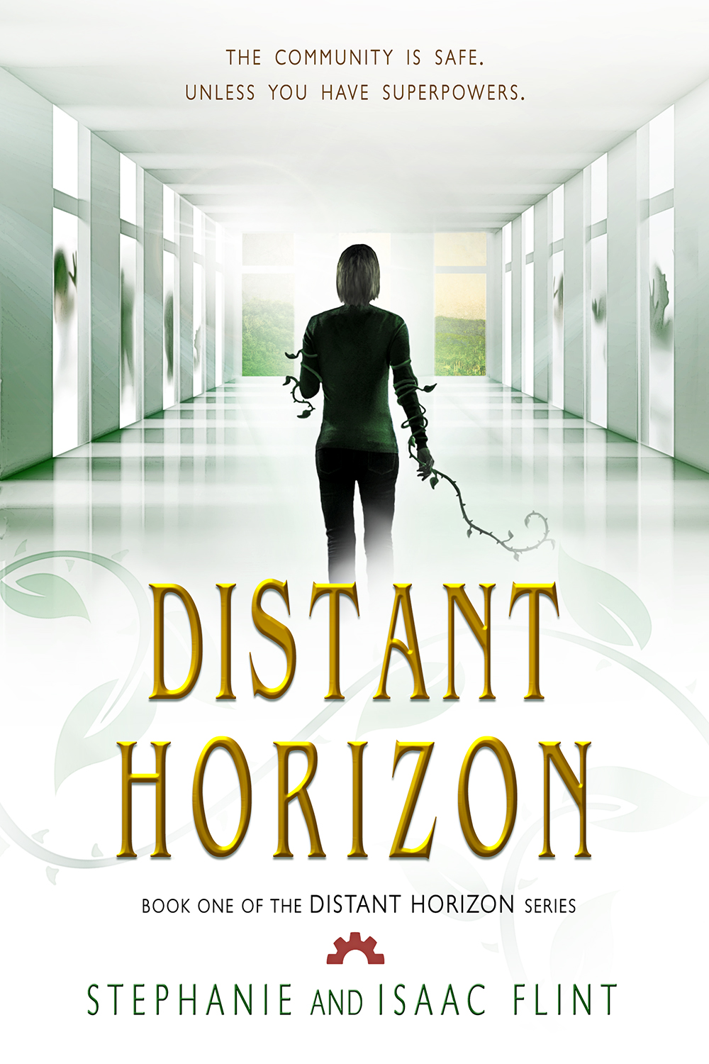
As I get closer to self-publishing “Ashes,” I thought it might be nice to do a cover reveal. So here it is, the cover to “Ashes.” It’s got some similar treatment done to it to resemble “Socks,” but it has a different color scheme to match the themes in the story itself. As an interesting little side note, I believe this is actually the same picture I used in “Socks,” but done differently enough that it shouldn’t be noticable. (Except that I pointed out, but anyway).
As a side note, I was debating on whether or not to include a blurb on the cover mentioning that it was a short story or prequel. After some discussion on Absolute Write, I decided not to include it. Why? Because the same information will be mentioned on the web page where it can be bought/downloaded. Also, because hopefully it will resemble the cover of “Socks” close enough that a connection will be made. Granted, this is experimentation on my part, but that’s kind of the point of doing this. 🙂
Without further ado, the new cover!
Also, as a quick note, I found this article and thought those of you interested in doing your own cover creation might like reading it. It’s about font choice. 🙂
http://clancytales.blogspot.co.uk/2012/07/how-to-font-your-cover.html


Let us know how your experiment turns out. I’m releasing a prequel novella also and I’m wondering if it should say as much on the cover. But the full length novel will be released later, so maybe I should? I don’t know, we’ll see. Good luck!
I’ll do that. I plan on keeping the blog post updated as I work on this. 🙂 Personally, I probably would make a note that its a prequel on the cover. It’s possibly that’ll I’ll later decide to add the information to this one. I guess a large part of it depends on if you decide you want to make a print version as well.
Oh ok. I do intend to use createspace for print copies, so maybe I will. Good luck!
Good luck. It’s something to consider, either way. 🙂