Another cover for Melange Books. Today I talk about how photomanipulation is like a puzzle. 🙂

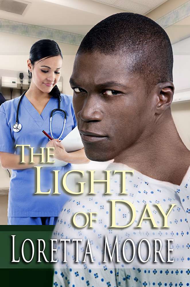
This was a case where character creation was useful. The author requested that we have the little girl sitting on the other character’s lap, who is dressed as Santa. In this case, I didn’t have much luck finding the perfect picture from the main stock site I used, so I wound up putting a few photos together to create the resulting image. Found a guy dressed in a Santa suit who matched the description– changed his hair color. Gave him a slight smile. Found a Santa hat. Found a little girl sitting cross-legged in pajamas– helpful. Found a sitting Santa to use for the lap… and used puppet warp on the arm. Found a background. Put everything together, and voila! Photomanipulation is a bit like putting together puzzle pieces, but it helps to have an idea of what the pieces look like before starting the search to find the right one. Kind of like finding the corner pieces first and working your way into the puzzle from there.
Stock Photos from Dreamstime:
http://www.dreamstime.com/royalty-free-stock-images-teen-punk-santa-image5438109
http://www.dreamstime.com/royalty-free-stock-image-portrait-handsome-guy-image3590996
http://www.dreamstime.com/royalty-free-stock-photo-girl-sitting-santas-lap-getting-hug-image27538055
http://www.dreamstime.com/royalty-free-stock-photos-beautiful-six-year-old-girl-sitting-pajamas-over-white-image125808
http://www.dreamstime.com/royalty-free-stock-photography-doctor-s-office-image480487#_