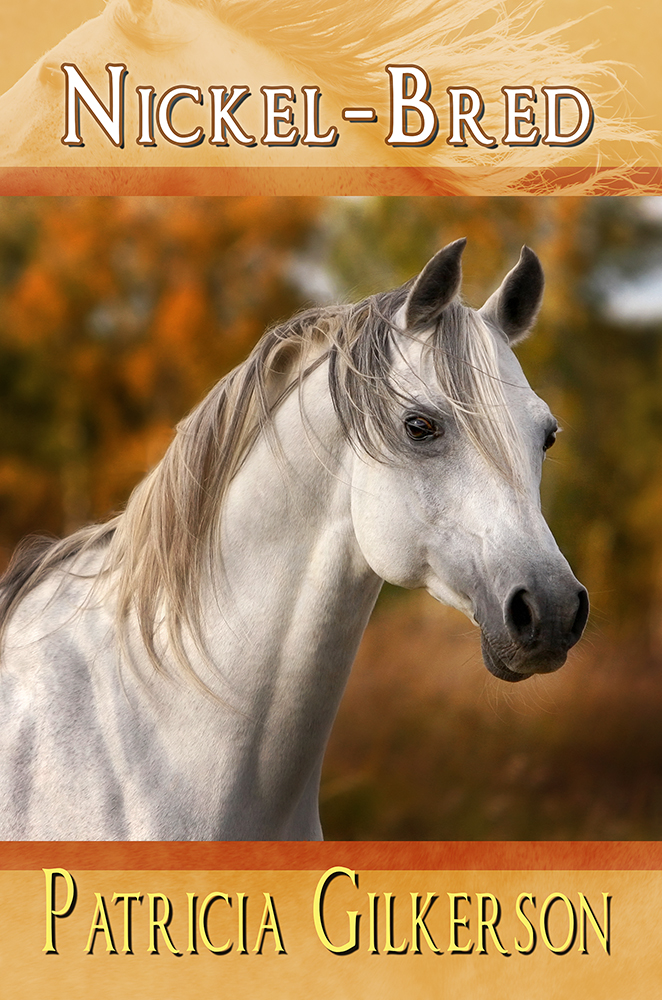
I know I usually just show one cover at a time, but in this case, I wanted to talk about creating book covers that are meant to be part of a series. These two covers are for Melange Books’ young adult line. In this case, I worked with the author to find images that worked well for the book (and in the case of Nickel-Bred, the author actually suggested the picture from Dreamstime, and it worked well without needing to be changed). For these covers I had set a specific style of editing and formatting. A block of color above and below the photo, with the title on top and the author’s name at the bottom. Position varied a bit, but I kept the same font in both. Keeping the scheme the same, it should be easily visible that they are of the same series or type of book. Also, being that they are meant to be of a more realistic/contemporary nature, I didn’t do a whole lot of extra editing. I did edit for lighting effects (see the stock images listed below for the changes), and on The Penny Pony I changed spot color and added ear tufts per the author’s request.
So, even thought the colors are different, the style remains relatively similar. Something to think about if you’re designing a cover or having one designed, is how well can you tell the book are of the same “brand” or series.


Stock Images for The Penny Pony:
http://www.dreamstime.com/stock-image-appaloosa-pony-portrait-image20085031
http://www.dreamstime.com/stock-photo-appaloosa-coat-image888990
Stock Images for Nickel-Bred:
http://www.dreamstime.com/stock-photos-arabian-horse-portrait-image12661463
http://www.dreamstime.com/royalty-free-stock-images-arabian-horse-image25455479
Photoshop CS6, as usual. 🙂
By the way, if you didn’t know, you can find my work at my Deviant Art account, where I usually upload book covers before I talk about them here. 🙂
http://sbibb.deviantart.com