Tag Archives: designing a book cover

Updating the Cover for Whispers in the Code

Sometimes we authors like to test different book covers to see if one might resonate better with readers. And Whispers in the Code, being a spin-off from the Distant Horizon series, has been through several iterations in my attempt to signal just what kind of book it is. (Genre-mashup. It’s very much a mashup with a lot going on… though horror underlies the entire trilogy).

Part of the job of being an indie author is figuring out which cover attracts the right readers (or rather, which cover is conveying the genre that best fits your book). It’s something I’ve struggled with for the Glitch saga, because it’s a genre mashup.

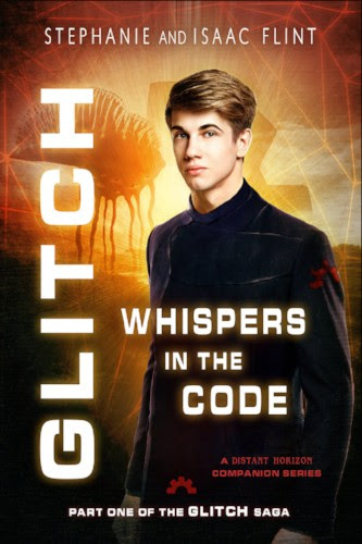
While I really like the original cover, I think it might convey more of a space military vibe… which it isn’t. Someone who goes in looking for the tropes of a space military story probably isn’t going to find what they’re looking for.

So, around October of 2019, I got the inspiration to test a new cover for Whispers in the Code.

My thought was, depending on how it goes, I’d either change the rest of the series to match it, or switch it back to the original.

Original Cover (February 2018)

Version 2 (October 2019)

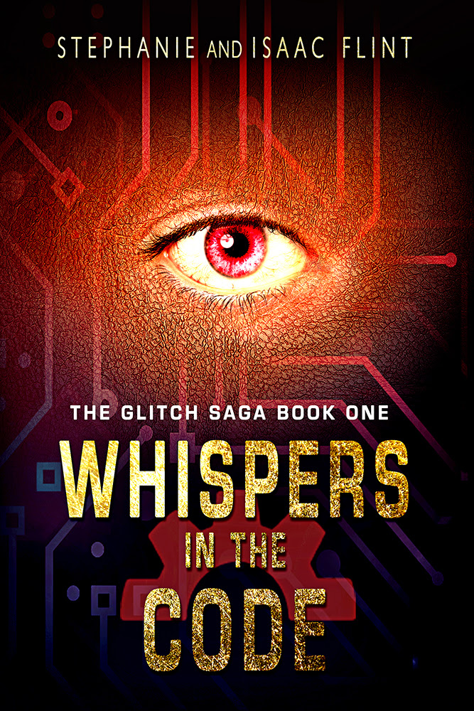
While I still really like the newer cover, which I redid in hopes of hitting a more cyberpunk/dystopian vibe, and it did pick up a few more readers in KU (Kindle Unlimited)… it seems that those readers didn’t get very far before they stopped reading (in contrast to Huntress, where they typically finished in a day or two and moved on to Changeling).

Though I didn’t have a whole lot of data to back that up, since Whispers in the Code wasn’t getting many readers, I did wonder if it’s possible that either A: Something was wrong with the book, or B) Readers were picking up the book expecting one thing, and finding something else (such as getting a lot more “magic” or a style of writing that’s more similar to what I’ve seen in YA and urban fantasy than solid cyberpunk).

So…

In February of 2020, I decided to try giving another cover a trial run for Whispers in the Code.

I put it together fairly quickly, and there’s a few things I wanted to change if I switched to this cover style for the series. But I hoped to convey more of the horror elements and more of the “magic” sense of things, while still hinting at the fact that technology is present (since it is set in the future).

Version 3 (February 2020)

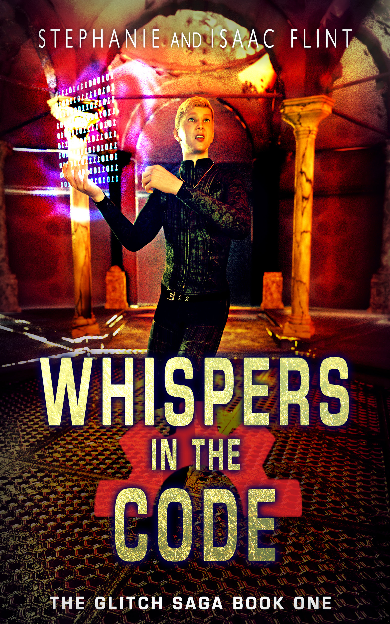
I left the new cover up for a few months to see if it would get a better response from readers, though I knew I also needed to consider how to drive traffic toward it. I had hoped putting it in Kindle Unlimited would give more people to take a chance on it, but that wasn’t going to help if I’m not targeting the right readers.

In August of 2020, I did one more revamp to the Glitch series ebook covers. While I really enjoyed writing the series, it still hadn’t gotten much attention from readers.

At this point, I attributed that to a few factors:

  • Wrong cover for the audience
  • Very cross-genre, hard to market
  • Jumps right into the action without a lot of explanation

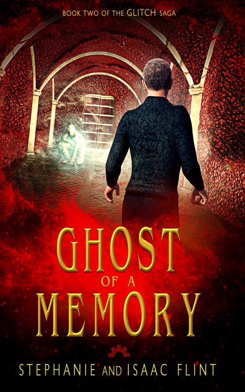
And so the August 2020 cover marked the fourth version for Whispers in the Code. For this version, I drew in part from the style of Distant Horizon, but tried to play up the paranormal aspect a bit more.

I also redid the blurbs.

Though I’m still iffy on the blurbs (and which one is really better might be a blog post for another day), these covers are the most true-to-the-book representations, I think.

(And while I haven’t analyzed the data on the different downloads, especially since for a time they were in Kindle Unlimited before I launched them wide and made Whispers in the Code permafree, I do see a handful of downloads of Whispers in the Code without extra marketing.)

Version 4 (August 2020)

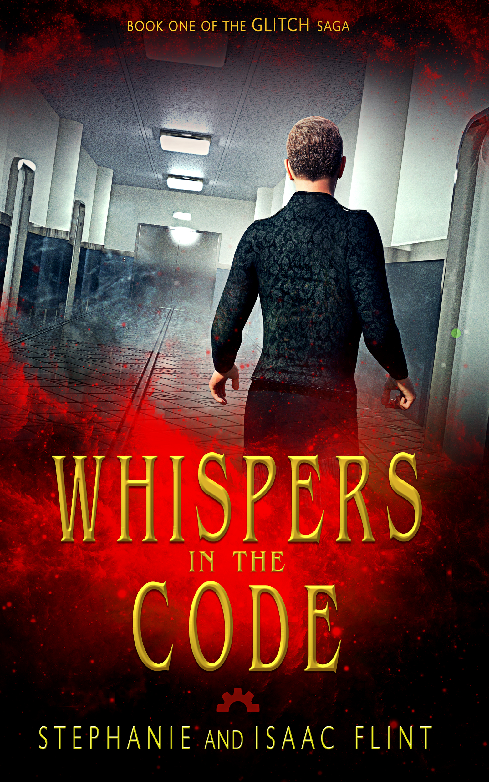
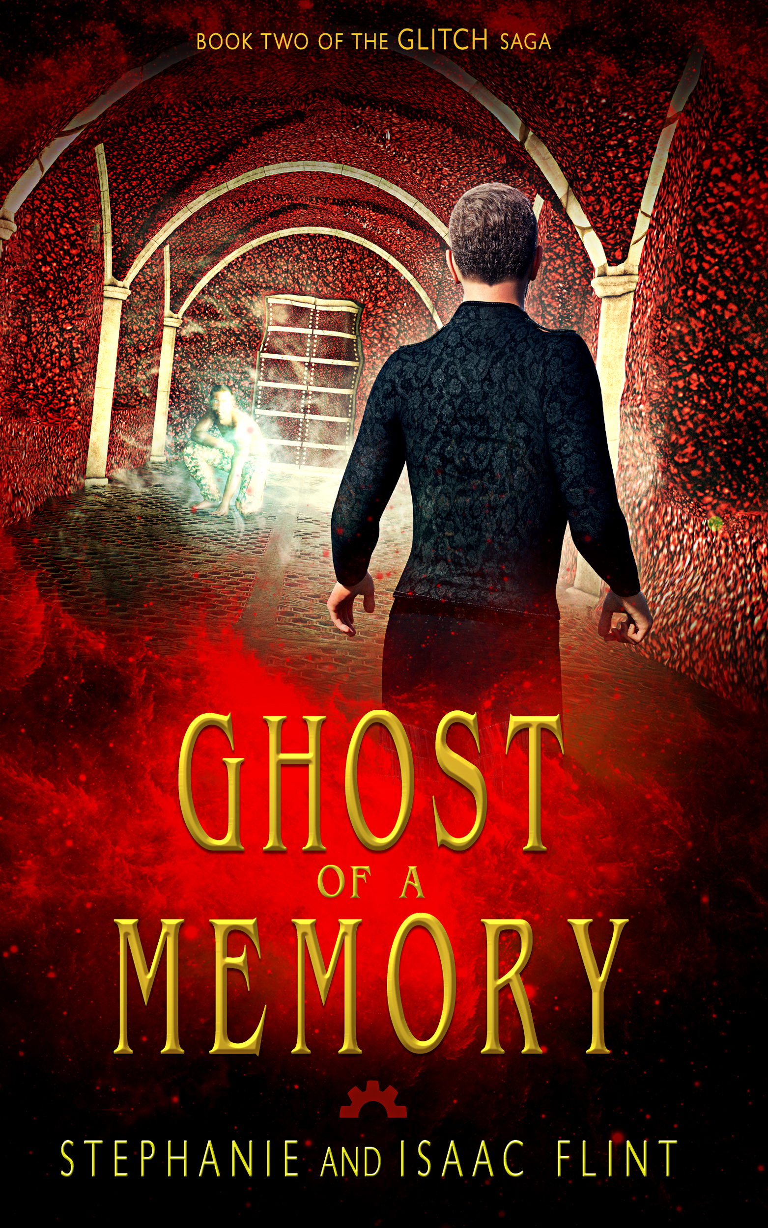
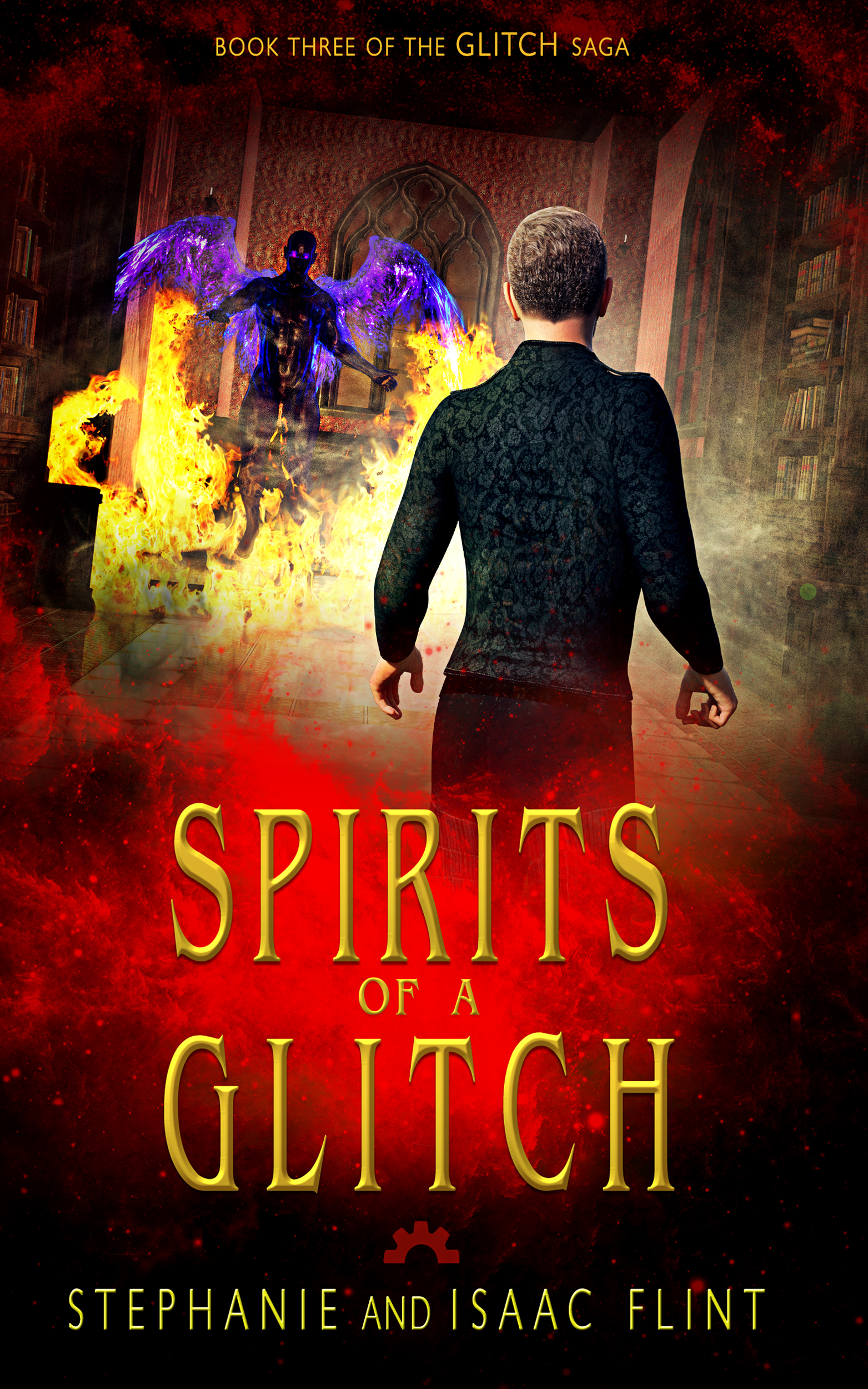
I’m hoping these covers will attract readers interested in science fiction, thrillers, and stories with paranormal elements.

And one of the things about the Distant Horizon universe is that it has a lot of different elements to it. The issue that creates is knowing which readers to target when marketing.

For example:

It’s science fiction… with a lot of technobabble jargon and what-if world building, set in the future of a world similar to this one except that super powers started showing up sometime in the ’50s and an organization of super villains took over around 2012 to 2016.

It’s paranormal… because there are both the technical equivalent of ghosts (the Legion Spore’s glitches haunting the airship), and very literal ghosts (the spirits like Benjamin… a mad scientist who attached himself to an enchanted artifact).

It’s steampunk (actually gaslamp)… because there’s a lot of clockwork type references and aesthetics pointing that Victorian/Edwardian direction–though now that I’m more familiar with gaslamp fantasy, I’d say it’s gaslamp because of the heavier focus on “magic” and secret societies with a mysterious agenda (the Camaraderie of Evil).

It’s fantasy… because there’s a lot of epic type world building, enchanted artifacts, “magic,” lords and ladies, ballroom dances…

It’s a psychological thriller… because of the page-turning, high stakes element and mental games the main character faces…

An important part of marketing is knowing who to target and how to let them know this is the kind of book they’ll want to read. But with so many elements, it can be hard to pinpoint which genre is the best fit to work with (and some authors will switch marketing focus over time to bring in different readers).

This time around, I’m trying to lean into that gaslamp, paranormal sci-fi route… though I’m still not sure I’ve quite nailed that yet.

From a technical standpoint, an issue with the book itself is that it jumps right into the action and doesn’t take time to explain what’s happening, unlike Distant Horizon or Deceived. With that in mind, it may be that this series is better for readers who have already read the other series, rather than starting with this one. It’s a spin-off, and that may be hurting its chances of being read on its own.

*

So there you have it… four versions of the Glitch series covers. Eventually, I want to redo the box set cover. I’ve got ideas… I just need to set aside the time to revamp it.

* * *

Read the books whose covers keep changing… but at least now they match the mood!

* * *

Happy reading and writing!

Leave a comment

Filed under Writing

Designing the cover for The Restless Sands of Neel

Like many of my cover designs, especially my designs using Daz renders, the design for The Restless Sands of Neel had a major shift from the first iteration to the final.

Sometimes the title changes, too! Originally I was going to call the novella, The Dragon in the Desert.

But, after feedback from newsletter subscribers, I was worried it might disappoint readers looking for a more typical dragon.

Ro’nor, the protagonist, might have descended from dragons, but he doesn’t have wings or any of their special powers, and he can’t shift into their form. The biggest creature we see in the story is a monstrous pit worm.

So… after a bunch of brainstorming, deliberating, and tweaking words to see what else might work, I finally settled on:

The Restless Sands of Neel

Anyhow, here’s a look at the first proof I made for the cover:

There were some changes I already planned to make: a different set of robes/shirt, maybe a different hair once I double-checked what was stated in the story, possibly a different coat pattern for the horse to make sure it’s consistent with the story, and the final touch-ups to make it look like a polished cover.

I sent this out, along with the tentative title, to the newsletter, and several readers chimed in with their thoughts and suggestions. (Much appreciated!)

As a result, I ended up making some major changes, two based on making it more accurate to the novella (the horse’s coat color and the main character’s hair style), and I did a bit of work to make it more dynamic and personal (a common problem of mine, for some reason).

And so I ended up with this for the final version of the cover:

What do you think? Did the changes work in its favor?

* * *

Read The Restless Sands of Neel and see how a (sort-of) dragon fairs against a giant pit worm…

The Restless Sands of Neel Book Cover

* * *

Happy reading and writing! 📚

2 Comments

Filed under Writing

Behind the Scenes – Shadow Notes

This is a cover for Barking Rain Press. For this cover, the publisher wanted to stick with the blue and white color scheme, which plays a major role in the story. The author provided a few example covers of books with similar tones, which I used to get an idea of the design style: the style of scenery, the font and title placement, and the general mood of the cover.

This is the result:

Book Cover - Shadow Notes

Wraparound Book Cover - Shadow Notes

Stock images from Shutterstock:

http://www.shutterstock.com/pic-351762476/stock-photo-lonely-woman-walking-in-the-park-with-trees-at-snowy-day-snowfall-in-park-with-lonely-walking.html

http://www.shutterstock.com/pic-27596422/stock-photo-woman-with-psychic-pressure-in-a-corridor.html

http://www.shutterstock.com/pic-44825947/stock-photo-walk-in-winter.html

http://www.shutterstock.com/pic-156469889/stock-photo-frozen-land-in-winter-time.html

Leave a comment

Filed under Book Covers, Photo Illustration

Behind the Scenes – The Quarter Horse

A cover for Melange Books’s YA imprint, Fire and Ice. This is the fourth book in The Horse Rescuers series, and so we wanted to keep the style the same as the other books. In this case, we kept the same layout and font. We tried a couple different colors as the main color scheme (each book is a bit different), and ultimately settled on the gray-blue.

For the horse image, I used the art form to reference the kind of horse the author wanted, and then I created a lightbox on Dreamstime with several horse options (and I checked to see what general season I should be looking for). The author selected two of those images, which I made rough proofs. Once we narrowed it down, I finalized the cover.

This is the end result:

Behind the Scenes - The Quarter Horse

Rough version of the back cover (subject to change per the Publisher’s needs):

The Quarter Horse - Back Cover Blog

Stock photo from Dreamstime.

http://www.dreamstime.com/royalty-free-stock-images-bay-horse-image3555999 – horse

Leave a comment

Filed under Book Covers

Behind the Scenes – Sword of the Quest

A cover for Melange Books. For this cover, we wanted to match the covers of the previous books, Dragon Sword and Sword of Doom. The font and border placement remained the same, as did the leather textured background. The difference was the scene on the front. We tried a couple cover options before we came to this particular setup. (As a note, if you’re the cover artist working on multiple books in a series, and you have all the art forms for each of those books, make sure you don’t accidentally blend ideas from each form.)

Since there’s a lot going on in this cover, the lighting played an important role in balancing the cover. I made sure to have the main character fully lit, and thus in the spotlight. Next up was the woman, but I put her in slight shadow. The reader’s gaze falls first on the man, then her, then finally on the cloaked shadow in the background. The cloaked figure I shadowed the most. Partially because the figure is supposed to be mysterious, but also so the figure doesn’t attract the initial attention from the main character. Then, once all the pieces were in place, I added the specific lighting from the emerald, that way the whole scene fell together.

For the runes on the altar, I drew them in one color on a separate layer and then tinkered with the “bevel and emboss” special effect until they looked like they were part of the stone.

This is the result:

Behind the Scenes - Sword of the Quest - Book Cover

Stock images from The Dollar Photo Club (Stock site sold to Adobe Stock, individual links no longer work): katana //  wolf //  woman’s head / man’s arm / man’s legs / man’s torso
Stock images from Dreamstime:
http://www.dreamstime.com/stock-photo-angkor-wat-temple-inside-corridor-walls-cambodia-image26822490 – temple

http://www.dreamstime.com/royalty-free-stock-image-leather-clad-warrior-image265556 – leather tunic

http://www.dreamstime.com/stock-photography-ancient-roman-stone-pedestal-image12983352 – stone pedestal

http://www.dreamstime.com/stock-photo-emerald-isolated-image16275280 – emerald

http://www.dreamstime.com/stock-photo-dangerous-vampire-catacombs-full-skulls-bones-horror-fantasy-image64756682 – cloaked figure

Leave a comment

Filed under Book Covers, Client Work

Behind the Scenes – On A Midnight Clear

This is a cover for Melange Books. For this cover, the author wanted something that showed a cabin in a snowy region and kept with the dark mood of the story. They had already found an image that they felt worked well, so I was able to find a similar one from the stock site we normally use in order to create the cover.

My first attempt at a proof for this cover included silhouettes of the characters, but it didn’t convey the right mood. So I went a more simple route, using the mysterious, dark purple color as the base of the cover, with a narrow focus on the cabin in question. I also changed my initial font to something a bit more bold.

This is the result:

Book Cover - On A Midnight Clear

Back of Book Cover - On A Midnight Clear

Stock image from Dollar Photo Club:

https://www.dollarphotoclub.com/70616736 – cabin


Leave a comment

Filed under Book Covers, Client Work

Behind the Scenes – In the Camp

This is a cover for Melange Books‘ young adult imprint. For this cover, the author wanted a symbol rather than a scene, and in their art form they mentioned that their story revolves around elves using nature to reclaim the modern human cities after a devastating war. Based on that, and since the author said that there was a phone that played a large role in the story, I tinkered with the idea of having an old, cracked phone on the cover.

Vines partially cover the phone (showing nature beginning to take over again), and I added the “reflection” in the phone’s screen to show more of the setting (a swampy area). To give the cover a dystopian feel, I used a couple grungy concrete textures in addition to the concrete background. For the text, I tried a bolder font to keep with the genre, and added a more “computery” text to the phone for the series title.

This is the result:

Book Cover - In the Camp

SBibb - ItCBackcoverBlog
Stock images from Dollar Photo Club:

https://www.dollarphotoclub.com/86638759 – concrete wall
https://www.dollarphotoclub.com/87991955 – ivy
https://www.dollarphotoclub.com/72301540 – cracked phone
https://www.dollarphotoclub.com/95588080 – Night Sky
https://www.dollarphotoclub.com/75505794 – abandoned warehouse
https://www.dollarphotoclub.com/69503655 – swamp
https://www.dollarphotoclub.com/84770412 – concrete grunge texture

Leave a comment

Filed under Book Covers, Uncategorized

Behind the Scenes – A Wolf Slayer Saga: Sword of Doom

This is a cover for Melange Books. For this cover, we based the style on the first book, Dragon Sword (See the cover of the first book here). The wolf at the top of the cover is the same, as is the placement of the text, and the border on the right side of the book. We also used the same model, though I used two separate images to get the right mood for the cover. I also did a bit of work with the puppet warp and liquefy tools in Photoshop CS6 to get the right build for the character (You can see the original photos in the link of stock images below).

This is the result:

SBibb - Sword of Doom Book Cover

SBibb - Sword of Doom Back of Book Cover
Stock images from The Dollar Photo Club:

https://www.dollarphotoclub.com/64831097 – leather texture
https://www.dollarphotoclub.com/48895294 – wolf head
https://www.dollarphotoclub.com/59929391 – swordsman
https://www.dollarphotoclub.com/66550844 – katana
https://www.dollarphotoclub.com/81491234 – fire field base
https://www.dollarphotoclub.com/81258902 – fire field overlay
https://www.dollarphotoclub.com/57977513 – field background
https://www.dollarphotoclub.com/4893388 – smoke
https://www.dollarphotoclub.com/86403951 – broken ruins
https://www.dollarphotoclub.com/63208980 – ravens
https://www.dollarphotoclub.com/61761712 – wooden ruins
https://www.dollarphotoclub.com/59929510 – man’s head


2 Comments

Filed under Book Covers, Client Work

Behind The Scenes – The Devil’s Third Book Cover Remake

Lately, I’ve been working on remaking the book covers for Rebekkah Ford’s Beyond the Eyes trilogy, and I just finished remaking the cover for the final book, The Devil’s Third. (You can see the other two book covers remade: Beyond the Eyes and Dark Spirits).

For the updated version, we settled on using an angel as the character on the cover. The author found a couple images she liked (we cycled through a few before choosing these two), and got the advice of her fans before settling on the current model. Then I found an older image I’d taken of a bird with outstretched wings, did some inversions to the colors (this was actually the inner portion of the wings, rather than the outside shot), and put together the composite image. Of course, we also tried to stick with the same placement and feel of the other two covers.

Needless to say, I think I’ve improved a lot since I first started making book covers. Now, here’s the remake of Rebekkah Ford’s The Devil’s Third, a paranormal romance.

Before:

SBibb - The Devil's Third - Book Cover

SBibb - The Devil's Third - Wrap-Around Book Cover

After:

SBibb - The Devil's Third - Book Cover Remake

SBibb - The Devil's Third - Wrap-around Book Cover Remake

Stock images from Shutterstock:

http://www.shutterstock.com/pic.mhtml?id=95544481 – man

http://www.shutterstock.com/pic.mhtml?id=309884051 – graveyard

All other images are my own.

Leave a comment

Filed under Book Covers, Client Work

Behind the Scenes – One More Night – Book Cover

For this cover, we wanted to keep to a similar theme as the first book, Separate Lives, but with enough differences to show the different tone and themes. So I kept the same general format and images, but found new silhouettes to link to the new characters. To distinguish the modern-day character, I gave him a dark, shadowy appearance that still let some of his features show through, unlike the ghostly characters in the background. For the back cover, I simply changed the color scheme of the first book’s back cover to mimic the color scheme of the second book.

This is the result:

SBibb -One More Night - Book Cover

SBibb -One More Night - Book Cover Back

Stock images from Dreamstime:

http://www.dreamstime.com/stock-photo-judge-gavel-image16964080 – gavel
http://www.dreamstime.com/stock-photography-texture-creamy-white-rice-paper-torn-edges-isolated-white-background-image29821402 – paper texture
http://www.dreamstime.com/stock-images-brown-package-paper-torn-to-reveal-white-panel-ideal-copy-space-image34962594 – torn paper texture

Stock images from Dollar Photo Club:
https://www.dollarphotoclub.com/Search?k=77165739 – saloon
https://www.dollarphotoclub.com/Search?k=95395250 – lady
https://www.dollarphotoclub.com/Search?k=60664546 – farm guy
https://www.dollarphotoclub.com/Search?k=70544393 – captain
https://www.dollarphotoclub.com/Search?k=80095962 – man

Leave a comment

Filed under Book Covers, Client Work