Tag Archives: masking

Behind the Scenes – The Poe Codec

A cover for Cave Hollow Press. For this cover, they wanted to incorporate elements of Edgar Allen Poe’s work and a feeling of a mystery. We settled on a raven and a locket (the locket plays an important role in the story) and we used the codec from inside the book (provided by the author) for the background. We went for red and black colors to add to the mysterious look, and I chose a cob-webby font that would add to the eerie mystery and work well for middle grade fiction.

I also did a wrap-around print cover. However, knowing that the primary form would be paperback–and knowing that CMYK does not play well with red– I created this cover first in CMYK (a smaller color space), and then converted it to sRGB for the online editions.

Something important to keep in mind when working with print editions is that if you download a template from Createspace, that template is in sRGB. You will need to convert it to CMYK prior to moving the image over for a wrap-around cover… or potentially need to redo portions of the image. (This is mostly a problem if you have a heavy amount of red on the cover.)

Another trick I found for getting the red color to work well in CMYK is to create a layer of red color based on the title (Hex Code: E32E24), overlaying it across all red portions of the cover (I masked out the locket and publisher logo), and the lowering the opacity to 30%. (I use Adobe Photoshop CS6). I’d read an article that suggested that CMYK does better with “pure” colors, and by adding the red overlay, that made the colors seem more “pure” for its color space.

I also did the interior formatting. You can check that out using the “look inside” feature on Amazon. 🙂

This is the end result:

Behind the Scenes - The Poe Codec

Behind the Scenes - The Poe Codec - Wraparound Cover


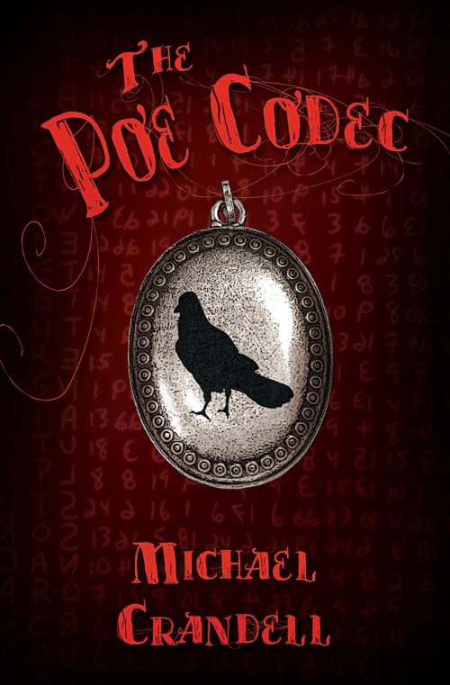
Stock images from Dreamstime:

http://www.dreamstime.com/stock-photo-raven-image36339410 – raven
http://www.dreamstime.com/stock-images-remembrance-image28935144 – locket

Code picture provided by the author.

Leave a comment

Filed under Book Covers, Client Work

Behind the Scenes – The Art of Madame Whitsome

This is a cover for Melange Books.

I really enjoyed putting this one together, especially given that so much of it was playing with how the textures interacted and overlapped. This was a case where the art form gave me enough detail to give me an idea what kind of mood I needed to convey, and the kind of symbolism that might work well, but gave me a bit of free reign as to what I actually did. The result? I had an idea almost immediately that I wanted to try, though it was a while before I had a chance to work on the actual cover.

Of course, the auto-align function in Photoshop CS6 came in helpful as usual, and I also played with various filters and masking to achieve the final effect. One thing to keep in mind when playing with filters, especially if you’re starting with a proof, is that it can be really helpful to name the layer you worked on with what filter you used, and the basic numbers you input into that filter. That way you achieve the same, or a similar effect on the final image. 🙂


SBibb - The Art of Madame Whitsome - Book Cover


Stock images from: Dreamstime.

http://www.dreamstime.com/royalty-free-stock-photo-grunge-texture-image19642535
http://www.dreamstime.com/stock-photo-grunge-wood-texture-image6312920
http://www.dreamstime.com/stock-photo-green-grunge-background-abstract-texture-image33062940
http://www.dreamstime.com/royalty-free-stock-photography-musical-notes-image6760767
http://www.dreamstime.com/stock-photo-sheet-musical-notes-image1041320
http://www.dreamstime.com/stock-photography-angel-wings-digitally-rendered-image-white-feathered-image31948892
http://www.dreamstime.com/stock-image-celtic-harp-chair-image17238791


2 Comments

Filed under Book Covers, Client Work, Photo Illustration

Architectural Photos

Recently I was asked for examples of my photography related to interior architectural type photography. While I didn’t have any recent examples, I remembered taking a lot of architecturally based photography last spring break in Dallas, Texas. So I pulled out the earlier external harddrive and went through the photos to find the ones I felt best represented the potential client. Then I used what I knew about levels and masking with layers to improve them with my current skill level. I sent them the slideshow of photos along with five other relevant photos for thier review.

http://www.flickr.com/photos/sbibb/sets/72157625811495552/show/

I don’t know if I’ll get the job or not, but it did help illustrate the importance of being visible in the community (the client found me while I was selling posters at the Holiday Market), and of working quickly to provide a portfolio.

Dallas Texas Architecture - SBibb

Dallas Texas Architecture - SBibb

Dallas Texas Architecture - SBibb

Leave a comment

Filed under Personal Work