Time for the March-April Infinitas Publishing status report! 📋
I had hoped to put this out sooner, but between vacation and then a second unplanned trip a few days later, this is coming out a little later than expected.
Lots happening, though, even with the chaos months having begun.
I’ve highlighted the projects that had changes in blue.
* * *
Changing Tides: (Book 4 of the Distant Horizon series). While no revisions were made on the draft, Isaac and I did discuss the climax of the series and possible options regarding the final battle. Additionally, some ideas were tossed around in regards to how the future of that world might look, which could affect what foreshadowing I focus on.
Otherwise, this is on hold while working on The Dark Forest of Aneth. Next step is to merge the two revised drafts and start writing the missing scenes.
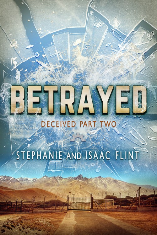
Betrayed (Deceived #2): I still need to finalize the post reviewing the launch for Betrayed, but I did start the process of making notes on the sales as related to promos with the exception of the sales I was still waiting to see finalized.
Next up, revising Deceived #3 (tentatively titled Exposed).
Other future steps: Input Isaac’s notes from Deceived #5 (formerly #4) into the manuscript, revise Deceived #5, and revise #6 (formerly #5) before handing it to Isaac for his feedback.
Dossiers (Deceived Spin-off): This is a short story I started during the Betrayed launch that, per usual, took on a life of its own. I not only included character bios for the main group of Deceived, I also included a running short story involving a future antagonist, Agent Shepherd. I’ve sent an episode at a time to Distant Horizon newsletter subscribers.
Since the previous status report, I’ve sent episodes for Nia, Erin, Luuk, an an additional chapter focused on Luuk’s brother. Currently I’m debating whether to continue the story a bit further or end it there.
Once complete, I’ll likely edit it to have as a bonus for newsletter subscribers. I haven’t decided if I’ll publish it separately.
Multiverse Chronicles (Distant Horizon Universe Spin-off): I dusted off the Scrivener file and made revisions to the prologue. I may be sharing this soon with the Distant Horizon Universe newsletter.
TWB 4: (Book Four of The Wishing Blade series). On hold. Next step is to add the remaining outline to Scrivener, review that outline for missing plot points, and then write the rough draft.
The Legends of Cirena – Collaborative Adventure Facebook Group:On hiatus. There’s a possibility I might move this concept to the Wishing Blade Universe newsletter, but that’s just a vague idea at this point.
The Legends of Cirena Volume One (Collection of books 1-6): This was one of the unplanned projects that I had in my list of maybe-get-done during chaos months. I already released the print edition a while back, but I hadn’t yet compiled the ebook edition.
Good news: I finally completed the ebook version!
I’ve created the Infinitas Publishing page for it, uploaded the ebook to most of the online retailers (with the exception of Google Play, which will be coming soon, and Smashwords, which needs a small file adjustment) and started preparing to send out ARC files.
The ebook version will release on April 22nd!
Next up: Create a launch week plan and order newsletter promos? (I’ve chosen a few but haven’t yet ordered them).
The Dark Forest of Aneth (“Ro’nor (“The Restless Sands of Neel”) & Zynia (“The Dragons of the Mist”) cross-over / A Legends of Cirena short novel): I essentially completed my goal for February, which was to finish another round of revisions and write the missing chapters. Woot!
However, there were more missing chapters than I realized. So I got the amount of work done as intended (plus a couple extra chapters), but there are at least two more chapters that need added, as well as heavy-duty revisions to the new chapters and another light revision pass after all that.
Additionally, I tested ProWritingAid’s new Manuscript Analysis feature, which provided both the suggestions I already intended to implement, as well as ones I hadn’t considered previously. So I intend to look over those in the next pass, too.
Goals: Revisit the book cover concept. Create a blurb.
The Ruins of Amixthael (The Gryphon and the Mountain Bear Spin-Off): I’ve started the continuity revisions. So far the first two chapters are complete. I’ve also drafted a Daz render for the cover. It needs a bit more work before I render the final version for Photoshop editing and the title.
Untitled LoC Short Story (Standalone – Merchant in Reveratch): I’ve drafted, polished and sent three more chapters to the Wishing Blade Universe newsletter. (We’re now on chapter five). Despite having an outline, this one is turning out longer than expected, but I’ve been having a lot of fun exploring this particular area of Cirena (both Reveratch and the Immortal Realm). I anticipate at least two more chapters before completion.
Additionally, I’ve been working on a related poem/ballad that explores the lore as related to this particular story. I haven’t decided yet if it’ll make it into the story.
The Wind Mage and the Wolf (“Livena (The Wind Mage of Maijev”) & Nuaka (“The Gryphon and the Mountain Bear”) cross-over / A Legends f Cirena short novel) : Joran’s short story is on hold. Still needs a couple scenes smoothed out, and I need to cross-reference the final scene in TheWind Mage and the Wolf (from Joran’s point of view). After that, it’ll be ready for a read-aloud and proofreading.
Huntress 3:On hold. Next step is to finish re-reading Changeling to make notes on the series guide, finalize the cover (proof created), and create a detailed outline.
Other Stories: I wrote a couple of flash fiction shorts that I posted to Substack. Both are set in the same fantasy post-apocalyptic world:
“The Courier” – A homesteader in a post-apocalyptic wasteland gets an unexpected delivery.
“The Proposal” – A nervous office worker turns in an ambitious proposal.
Next up: Revise ending of YA Alien Invasion/Dystopian story.
Game Design: Isaac designed a simple dice game (tentatively called Anchor). We’ve been beta-testing the basic rules and created a rough draft of a potential playmat. I’ve also been researching customized dice prices, and we’ve been working on gathering the pieces needed to create a prototype.
Marketing: The last couple months had far less focus on marketing than the previous month, though I’ve begun planning promos for upcoming launches. Meanwhile, these are some of the recent projects:
Amazon Ads same as usual, just the ones that were already running.
I scheduled Deceived for a BookFunnel promo that ran in March. That one was promoted in my Distant Horizon newsletter later in the month, along with a blog post. I also scheduled Stone and String for a couple promos in April. The newsletter is set to go but I still need to prep the blog post.
I tested an updated design for the individual book pages on the Infinitas Publishing website (Distant Horizon). Only one done so far, but I like the result. I’m planning to eventually update all the pages for the more streamlined design, though I may do a couple more setup tests before finalizing the general setup.
I sent out an email to the Distant Horizon Universe newsletter with a book promo for an author friend who had a new release.
Finished business taxes for 2024.
Hoopla removed a massive number of ebooks (most of mine included). I sent an email to D2D (the distributor) to follow-up on the reasons why, but haven’t heard anything new about having the books reinstated since the first reply acknowledging that this happened.
I revised the backmatter for all Legends of Cirena ebooks and updated them at all retailers.
I updated the mailing list automation for the Wishing Blade Universe newsletter.
Next up: Continue adding sample chapters to the BookFunnel sales pages for each book, and then to the main Infinitas Publishing website. Add BookBub and Goodreads links to each landing page. Update my author bio across the different retailers. Continue updating Stripe and Payhip so I can offer direct sales from the main website. Revise Amazon ads, and overhaul book categories, keywords, and blurbs.
Substack – Though I missed a couple weeks of posting, I continued posting writing tips and weekly roundups on my Substack.
Events: Isaac and I joined local author, R.Aveen, at the Portage Lake District Library for a YA Author panel. We had a lot of fun talking about our processes and the audience asked great questions.
Unfortunately we didn’t have enough people sign up for my Crafting Your Fictional World workshop at the Copper Country Community Arts Center, so that one didn’t run. I’ll be talking with the art center to decide on what workshops might work better to run in the future.
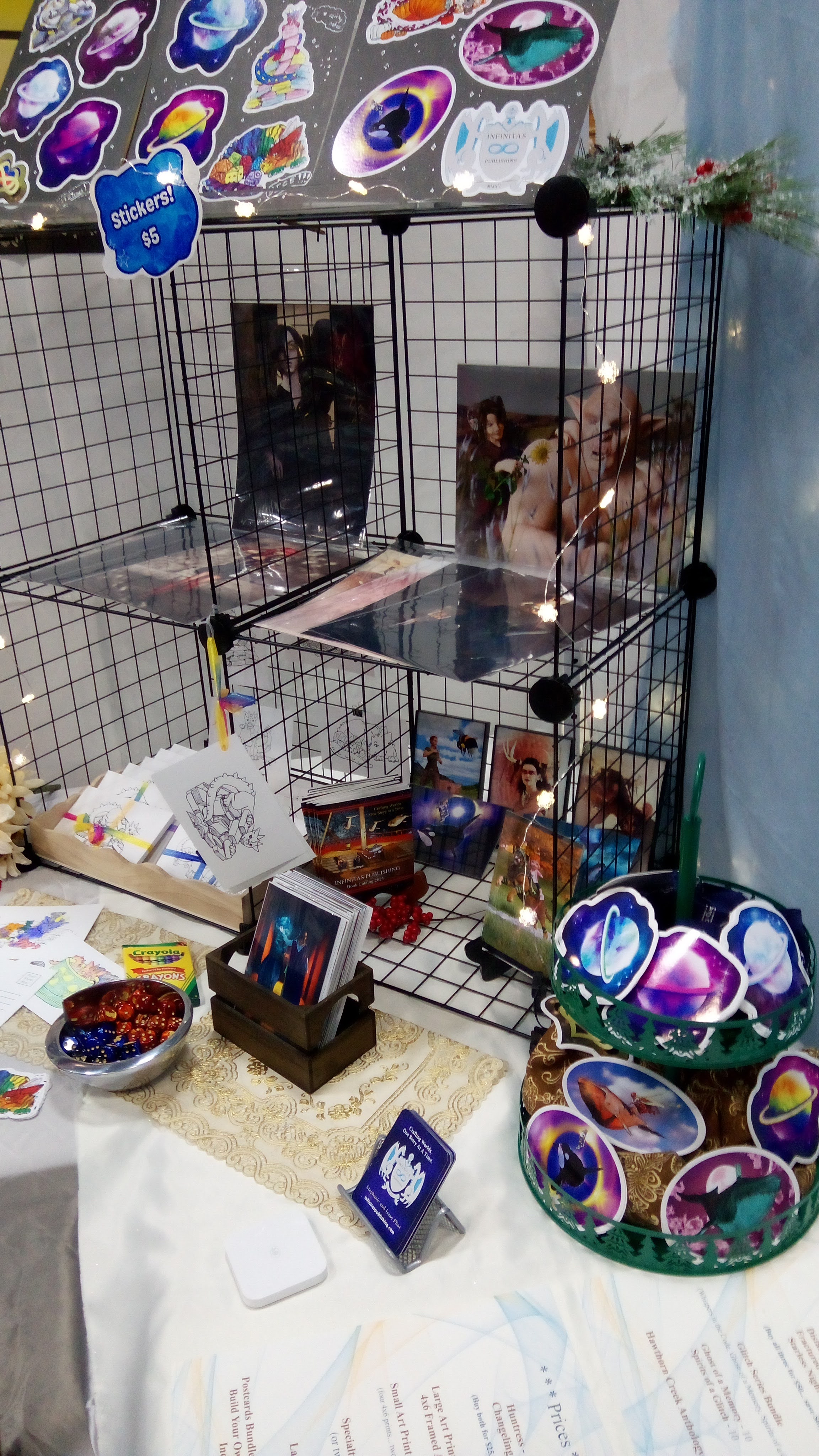
At the beginning of April we had a booth at the KYCA Art and Music Festival, where we primarily focused on our art prints. We added several new prints to the mix, using secondhand frames we found at various consignment stores. Additionally, I got to test out my metallic photo paper!
SBibb’s Photographic Illustration: I’ve finished my most recent book formatting project for Cave Hollow Press! You can now pre-order Just Willaby Helen Sheehy. I may have another formatting project coming up, but the details for that is still in the works.
Future Goals: Update the SBibbPhoto website to incorporate Daz work and fix the SEO information. Finish designing cute mascot for a local store. Finish editing photos for a local Aikido group.
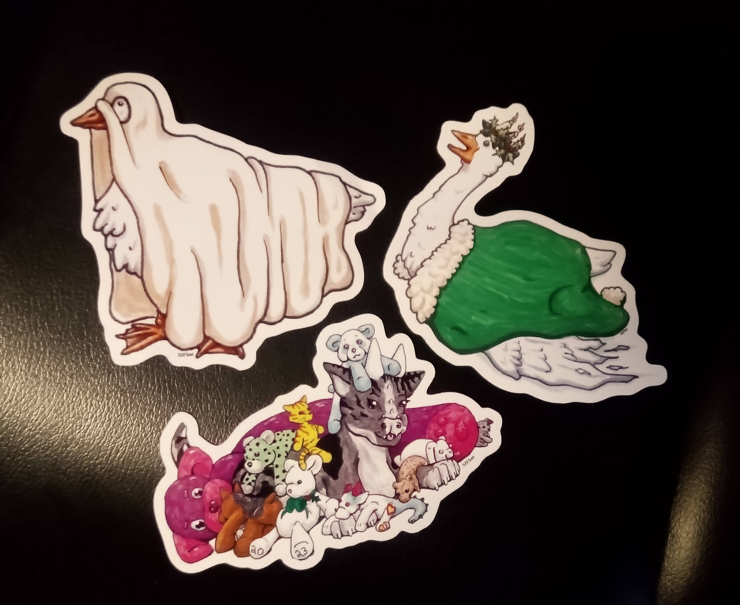
SIFlint Art: I’ve received the stickers from my most recent order! I’ve added a trans-themed shark hoarding dragon, as well as the Ghooste of Christmas Yet to Come and the Ghoosteling of Christmas Past.
Additionally, I finally placed my paper order with Red River Paper. I’ve already gotten to print on the metallic photo paper (which I framed for the KYCA Art and Music Festival), so my next step is to print more business cards. I do plan on printing and mounting one of the dragons as a display for future shows.
Daz PA: I took a series of snow and ice texture photos on a couple different photoshoots, which I started merging for the use of texture photos. I’m considering making another texture pack.
Other future projects include searching for a collaborator for my Genesis 9 Diverse Worlds set, and to complete some of the pose sets that Isaac started last summer before he got his new job.
* * *
Happy writing and reading (Or 3D rendering if you’re into Daz)! 🙂
Time for the February Infinitas Publishing status report! 📋
Let’s see if I can actually keep this thing going monthly this year. 😅
I’ve highlighted the projects that had changes in blue.
* * *
Changing Tides: (Book 4 of the Distant Horizon series). On hold while working on The Dark Forest of Aneth. Next step is to merge the two revised drafts and start writing the missing scenes.
Betrayed (Deceived #2): Released! My goal for January was to get everything set for launch, and it went live on January 28th! 🎉
I’m going to have a full-length post examining everything that I did for the launch later this month (I want to give the promotions on Deceived, which is temporarily free, time to follow through, that way I can analyze the results).
Long story short, I finished the proofread, updated backmatter in the related books, prepped several launch week emails for the newsletter, prepped a few goodies in the form of character dossiers with art, chose a few paid newsletter promos, and got the pre-order up and running!
Next up, revising Deceived #3 (tentatively titled Exposed).
Other future steps: Input Isaac’s notes from Deceived #5 (formerly #4) into the manuscript, revise Deceived #5, and revise #6 (formerly #5) before handing it to Isaac for his feedback.
TWB 4: (Book Four of The Wishing Blade series). On hold. Next step is to add the remaining outline to Scrivener, review that outline for missing plot points, and then write the rough draft.
The Legends of Cirena – Collaborative Adventure Facebook Group:On hiatus. There’s a possibility I might move this concept to the Wishing Blade Universe newsletter, but that’s just a vague idea at this point.
The Dark Forest of Aneth (“Ro’nor (“The Restless Sands of Neel”) & Zynia (“The Dragons of the Mist”) cross-over / A Legends of Cirena short novel): With Betrayed complete, this is my next big project. My goal for February is to finish another round of revisions, including writing the missing chapters. I’ve finished the initial input of the simpler suggestions Isaac had. Now it’s on to the bigger changes!
Goals: Revisit the book cover concept (which had been unfeasible until getting a more powerful computer that could actually render the scene in mind, but I may still overhaul the design anyway). Create a blurb.
The Ruins of Amixthael (The Gryphon and the Mountain Bear Spin-Off): On hold. Next step is whole-story revisions for continuity. At the moment I’m leaning toward publishing this a stand-alone ebook, but offering the final version of the story to newsletter subscribers for free.
Untitled LoC Short Story (Standalone – Merchant in Reveratch): I polled the Wishing Blade Universe newsletter regarding the details for the main character in the next short story (much like how I started new stories in the collaborative adventure Facebook group), and then created an outline from the winning results. The first chapter has been written, revised, and sent to the newsletter.
I’m expecting this to be complete between four to six chapters, and I’m rather excited for this one because, spoiler, I realized I could introduce an immortal that’s something like a selkie! 🦭
The Wind Mage and the Wolf (“Livena (The Wind Mage of Maijev”) & Nuaka (“The Gryphon and the Mountain Bear”) cross-over / A Legends f Cirena short novel) : Joran’s short story is on hold. Still needs a couple scenes smoothed out, and I need to cross-reference the final scene in TheWind Mage and the Wolf (from Joran’s point of view). After that, it’ll be ready for a read-aloud and proofreading.
Huntress 3:On hold. Next step is to finish re-reading Changeling to make notes on the series guide, finalize the cover (proof created), and create a detailed outline.
Other Stories: On hold. Next up: Revise ending of YA Alien Invasion/Dystopian story.
Game Design: On hold. Isaac made some notes for an astrology-themed game with some similarities to The Game of Life. I think this was more of a for-fun project, but what I saw of his notes looked interesting.
Marketing: Most of this month’s marketing efforts were focused on the launch of Betrayed, and I plan to have a detailed post about that later, so I won’t get too in-depth here.
Checked that Whispers in the Code and The Wind Mage of Maijev are still permafree. Created a private webpage with links to more easily check each territory on Amazon.
Created a promo for Deceivedto run for free between January 18th and February 19th. I purchased slots in a handful of paid newsletters to promote the freebie, in hopes that some of those might translate to purchases of Betrayed or Distant Horizon, or that I’d see a spike in organic newsletter subscribers. I also updated my paid newsletter spreadsheet, since I hadn’t updated it for a couple years. (Once all the promos have run, I need to update their numbers in that spreadsheet).
Sent ARCs for Betrayed after updating the list.
I didn’t tinker with Amazon Ads, so the only ones here were those that were already running.
No new BookFunnel promos for the month (though I have scheduled a newsletter swap with an author friend).
I announced the Deceived promotion, the pre-order of Betrayed, and then the release of Betrayed on Facebook and my blog.
I created a couple of extra detailed behind the scenes emails for the Distant Horizon Universe newsletter, as well as a piece of character art and a few character bios, but written to be a dossier from the point of view of a future antagonist.
Isaac and I took a business trip to Marquette to update our UPS mailbox for the newsletter.
I wrote a blurb for Betrayed.
Printed a calendar of the year so I could mark out the dates I expect to be busy or that already have events planned, that way I can better see when different projects are likely to happen.
Next up: Continue adding sample chapters to the BookFunnel sales pages for each book, and then to the main Infinitas Publishing website. Add BookBub and Goodreads links to each landing page. Update my author bio across the different retailers. Continue updating Stripe and Payhip so I can offer direct sales from the main website. Maybe add a progress tracker somewhere for the different books? Revise Amazon ads, and overhaul book categories, keywords, and blurbs.
Substack – I’ve continued adding writing tips to my Substack, though I scaled it back from six times a week to five. (In theory, I don’t post on Sunday or Wednesday, but sometimes that gets shuffled around a bit).
Events: No events for January, though Isaac and I will be joining local author, R.Aveen, for a YA Author Panel at the Portage Lake District Library on February 6th, so I’ve been helping with making the flyer for that and creating a list of moderator questions.
On February 21st, I have another rendition of my free, Crafting Your Fictional World workshop at the Copper Country Community Arts Center.
SBibb’s Photographic Illustration: I’ve finished my most recent book formatting project for Cave Hollow Press! You can now pre-order Just Willaby Helen Sheehy. I may have another formatting project coming up, but the details for that is still in the works.
Future Goals: Update the SBibbPhoto website to incorporate Daz work and fix the SEO information. Finish designing cute mascot for local store.
SIFlint Art: I’ve colored the line-art for my Ghooste of Christmas Yet to Come and the Ghoost of Christmas Past, as well as finished my trans, shark-hoarding dragon art. Those have been polished and the stickers are on order!
Eventually I’d like to place another order with Vograce, but we’ll see whether or not the tariffs make that unfeasible. I’ve also been looking at nifty little micro puzzles, so I’m investigating whether those might be an option in the future.
I got my sample paper in from Red River Paper, so I created a test page with a few different images to try and ran that image across each different type of paper.
*Cue very, very delighted Stephanie. And also a housemate’s happy cat perched on top of the printer.*
The results came out great, so my next step is to decide which projects I want to focus on so I can order the paper I need for them.
Daz PA: On hold. Next step is to search for a collaborator for my Genesis 9 Diverse Worlds set, and to complete some of the pose sets that Isaac started last summer before he got his new job.
* * *
Happy writing and reading (Or 3D rendering if you’re into Daz)! 🙂
It’s time for another Infinitas Publishing status report! 📋
I guess we’re going to go with “bi-yearly” instead of monthly this time around because summer was a rollercoaster, winter came and went, and I now have a lot to talk about since our last report in mid-May. (For the overview of life in general, check out this blog post.)
Meanwhile, I’ve caught up with inputting all the notes from my planner (I use it less to plan for future events and more to keep records of daily happenings), and here’s what the last half of last year looked like!
I’ve highlighted the projects that had changes in blue.
* * *
Starless Night:(Book 3 of the Distant Horizon series). I updated the blurb across all retailers.
Changing Tides: (Book 4 of the Distant Horizon series). On hold while working on The Dark Forest of Aneth. Next step is to merge the two revised drafts and start writing the missing scenes.
Betrayed (Deceived #2): Major progress! I set a goal to finish edits and get this sent to beta-readers in November as an informal sort of NaNoWriMo. Success!
I finished copy edits in ProWritingAid, proofread that draft, and sent it to beta-readers. I’ve started exploring the Critique feature in ProWritingAid to see if it provides any additional insights. I’ve reviewed beta-reader feedback and I’m almost finished with the final proofread, and have been preparing a blurb. The next step is to set the release date. I have one in mind. ☺️
Additionally, I drafted an update about Deceived #3 but I don’t think I posted it. I had been planning to release it on this blog, but I’m currently leaning toward focusing on releasing it as an ebook without early chapters.
Other future steps: Continue revisions on Deceived #3. Add Isaac’s notes from Deceived #5 (formerly #4) into the manuscript, revise Deceived #5, and revise #6 (formerly #5) before handing it to Isaac for his feedback.
TWB 4: (Book Four of The Wishing Blade series). On hold. Next step is to finish adding the remaining outline to Scrivener, review that outline for missing plot points, and then write the rough draft.
However…
Working on The Ruins of Amixthael prompted a huge amount of world-building and backstory plotting as it relates to the shadow realm, and also the general booky multiverse, so I now have some rather helpful additional context that should make plotting for book four considerably easier.
The Legends of Cirena – Collaborative Adventure Facebook Group:On hiatus. There’s a possibility I might move this concept to the Wishing Blade Universe newsletter, but that’s just a vague idea at this point.
The Dark Forest of Aneth (“Ro’nor (“The Restless Sands of Neel”) & Zynia (“The Dragons of the Mist”) cross-over / A Legends of Cirena short novel): Isaac has read the semi-revised draft and provided feedback. We’ve also discussed potential changes, and I’ve added his notes to the manuscript in Scrivener. I started the process of making revisions per those notes, but I’ll likely restart this process once Betrayed is set for publication.
Goals: Add the last few scenes and polish. Revisit the book cover concept (which had been unfeasible until getting a more powerful computer that could actually render the scene in mind, but I may still overhaul the design anyway).
The Wind Mage and the Wolf (“Livena (The Wind Mage of Maijev”) & Nuaka (“The Gryphon and the Mountain Bear”) cross-over / A Legends f Cirena short novel) : Joran’s short story is on hold. Still needs a couple scenes smoothed out, and I need to cross-reference the final scene in TheWind Mage and the Wolf (from Joran’s point of view). After that, it’ll be ready for a read-aloud and proofreading.
Huntress 3:I finished re-reading Huntress and started re-reading Changeling while making notes on the series guide. Parts of it have been organized, but overall, progress has been made in this regard.
Additional details regarding the augments were fleshed out since we had planned on using this series for our interactive display at GeekUP Chibi 2024 this year. However, due to our role as co-event coordinators, we didn’t get a chance to actively promote the display. Since all the materials (including a fun, fake personality assessment in regards to augments) and props are ready to go with this, we’ll likely use this display at another event when the opportunity arises.
I’ve created a proof for the cover, which still needs to be finalized.
Next up: Finish re-reading Changeling for the series guide and as a refresher, and finish creating a detailed outline.
The Ruins of Amixthael (The Gryphon and the Mountain Bear Spin-Off): Fully revised draft complete at 9000 words!
I continued writing the rough draft and revising this. I’m not sure how far along I was in the previous report, though I had already sent out the first two chapters to my Wishing Blade Universe newsletter and started writing the third chapter. I’ve now written the rough draft for all six chapters, revised them, read them aloud to Isaac, and sent them out to the newsletter.
The next step is to make whole-story revisions for continuity, then decide what to do with it. I’m still considering making this a newsletter reader magnet, but I might also release it as a stand-alone ebook.
Tangentially, I have been considering the concept of running a Kickstarter for a hardcover edition of the Legends of Cirena: Volume One, and have been starting to put together a report for myself to see whether or not this would be feasible in the near future.
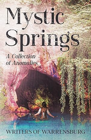
Other Stories: The second Writers of Warrensburg Anthology, Mystic Springs: A Colletion of Anomalies, is now available! My paranormal short story, “Will-o’-the-Whisker” is included. 😸
Currently, it is available as a paperback book and ebook. The ebook edition will be exclusive to Kindle Unlimited for a year.
In other news, Isaac wrote a 7000-word literary-ish short story about the life of our cat, Skynyrd, as a Christmas gift for me. I don’t know if he plans to polish it later or not. (I wrote around 1700 words shortly after our cat passed away, but those were mostly as a way to remember him and not intended to be shared). As a Christmas gift for Isaac, I drafted a short story/children’s book script for Isaac which I lined the art of a page of, but I don’t know if I’ll try to develop it further.
For the Distant Horizon Universe newsletter, I wrote a 2000 word short story about the Ghost Cook, in addition to a couple other short pieces.
Next up: Revise ending of YA Alien Invasion/Dystopian story.
Other on hold projects include: a “for-fun” space/portal fantasy story rough draft, Mermaid/Siren Sci-Fi short story draft, and comic script (“If I Had Asked”).
Game Design: On hold.
Marketing: There are a lot of little odds and ends here, so I’ll see what I can do to summarize.
I still have Whispers in the Code and The Wind Mage of Maijev permafree. However, I need to set a schedule for regularly checking these and prompting Amazon to price-match them. For a while, a number of the other territories weren’t marked free since I hadn’t had a chance to check them. (Retailers aside from Amazon should have been fine).
I attempted to create marketing plan, which was specifically focused on ebooks, but due to summer chaos, didn’t have a chance to implement many of the ideas
I scheduled a couple month’s worth of book-based art on Facebook, Instagram, and Twitter/X, which were art pieces I had previously shared with my newsletter. While I liked the concept, I didn’t see much engagement, and so I cut it off after the scheduled posts ran out. I saw potential engagement with Instagram reels, but didn’t particularly enjoy making those. I may experiment with reels again later.
I updated my method of accounting for Infinitas Publishing and added a way to see what each book is doing per year. I still need a better method of keeping this consistently updated.
I provided consultation for a couple local authors regarding self-publishing options. This was fun, I enjoy the topic. 😅
I watched a few free webinars/podcasts here and there, both for marketing and writing/publishing, and continued reading related books.
I picked up and watched the Book Blurb Magic Box Set edition course. At this point, I need to rewatch it, though I had started making notes for updates to book blurbs.
I approached another semi-local store about carrying my books, but the inability to handle returns made it difficult (this is where branching into Ingram Spark as a printer might be useful).
HOOPLA! Our books have finally uploaded to Hoopla! (This is great for online library access). I eventually added Hoopla links to Infinitas Publishing Website.
Since we started doing more than a couple live events a year and no longer qualified for the Special Event sales tax form, we acquired a MI sales tax license. (Disclaimer: I am not a tax consultant and can’t provide advice here. I’ve worked on this to the best of my own knowledge of reading what I could find regarding sales tax in MI).
I rebooted the Distant Horizon Universe and Wishing Blade Universe newsletters with attention to providing either a short story or art piece in each newsletter, but going ahead and sending it even if I don’t have either, so as to avoid the long, unplanned hiatus. I also did a couple BookFunnel promos, though I haven’t returned to doing them regularly yet.
Very minor testing of Amazon Ads, with a single test based on one specific book, and I reviewed my UK ads (which were apparently still running though I thought I’d turned them off).
I’ve started tinkering with Notion for project planning. I’ve got quite a bit to learn before I expect it would truly be effective, but it looks like it has potential.
I started a spreadsheet with a list of events that we’re interested in keeping an eye on for vending at, though I need to update this before future use.
Next up: Continue adding sample chapters to the BookFunnel sales pages for each book, and then to the main Infinitas Publishing website. Update my author bio across the different retailers. Continue updating Stripe and Payhip so I can offer direct sales from the main website. Maybe add a progress tracker somewhere for the different books? Revise Amazon ads, and overhaul book categories, keywords, and blurbs.
Substack – I finally jumped into the waters of Substack, and I’m pleasantly surprised to find I’m liking it. Mostly I like the notes feature, which reminds me a lot of how tweets used to be on Twitter/X. Additionally, having the long form posts connected to it like blog posts… there’s something about this that works for me, especially since I’ve been focusing on using it for further learning as it relates to writing. On my end, I’ve been posting daily writing tips. I tested doing a weekly writing prompt, but decided I preferred putting my energy into tips and responding to interesting articles. Click here to read my Substack!
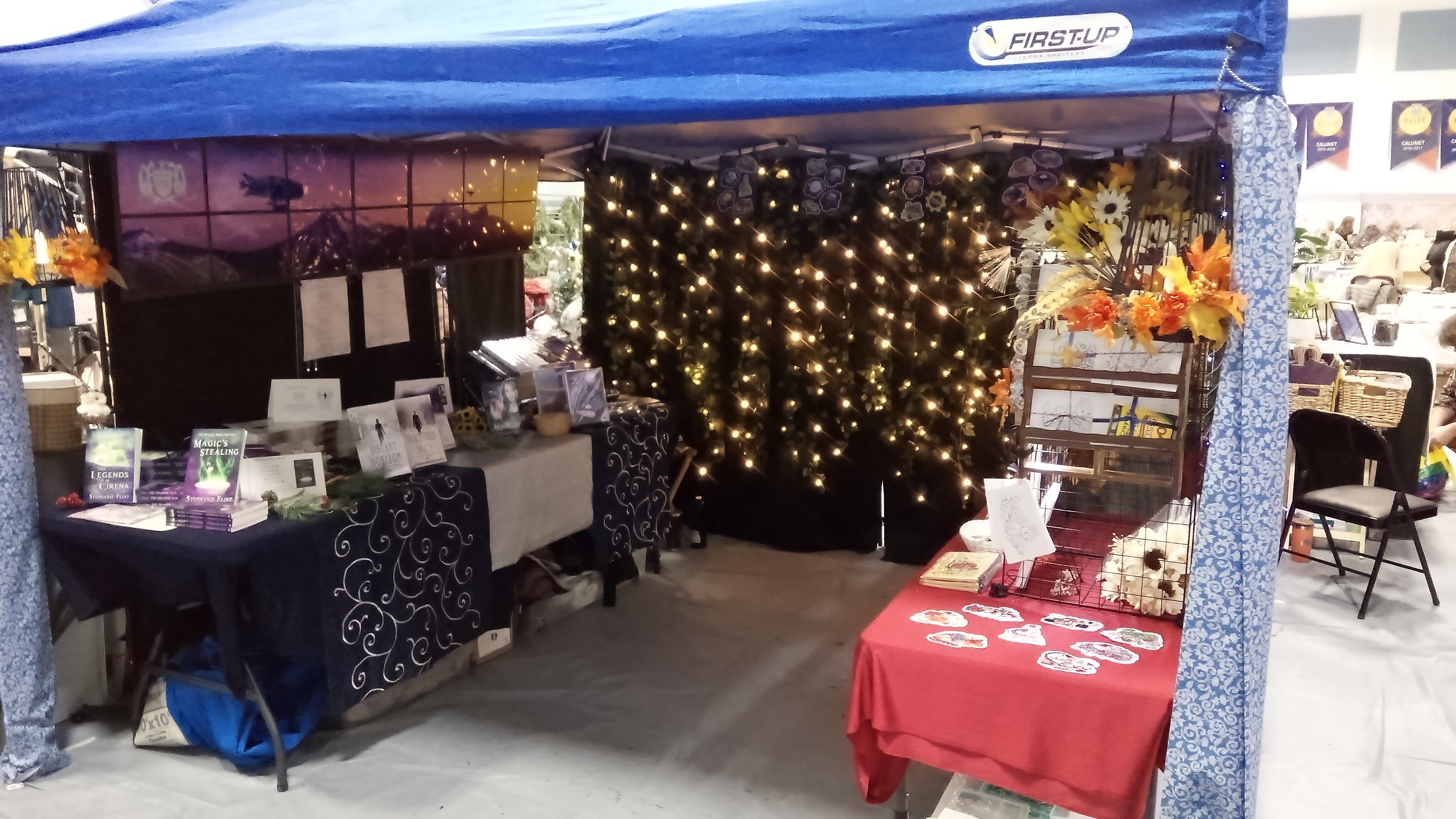
Events: Isaac and I made a lot of updates to our booth design for live events, including branching off part of the booth for SIFlint Art, or, more specifically, for the new Everyday Dragon Hoards line. This is a work-in-progress, but we finally have it streamlined enough that we’re no longer staying up until two in the morning trying to finish a last minute set piece. (For the first time in ever, we had everything ready to go for the Poor Artists Sale before midnight!)
Anyway, here’s an overview of the different events we participated in:
While in Missouri on vacation, we prepped a Self-Publishing 101 presentation. Unfortunately, no one showed up for the actual event, but after talking to my aunt and my mom about the topic, we determined that maybe we needed to scale back the presentation. It was more like Self-Publishing 201 or 301… and we’d rather not scare off people interested in the option with too much information all at once.
I ran another Crafting Your Fictional World class at the Copper Country Community Arts Center, which was fun as usual and prompted more ideas for the Crafting Your Fictional World book I’d like to finish writing.
Isaac and I were invited to give a presentation to a sci-fi writing class at the local university. We focused on the use of role-play games for plotting, created a couple basic scenarios for the students to try, and provided everyone with a D20. (I think they enjoyed the dice).
For SIFlint Art, we joined in with several local artists and participated in the K.C. Bonker’s gallery: Daydreams and Tonics art show. This was a gallery-style showing for a group of local queer artists to showcase their work during Pride month, and we had a lot of fun. We used many of the art pieces we had framed for the KYCA (Keweenaw Youth for Climate Action) Earth Month Festival, and even sold one of the smaller framed prints that Isaac designed! (It was the fun parhelion-themed space orca one, which we’d found a cool iridescent frame to use for).
You can see three of our framed images… the one at the very top in a gold frame, the one with the red whale beside the lamp, and the one in the iridescent frame on the other side of the lamp.
Queer Artists Pop-Up Table at Black Ice Comics & Books
Though I worked during the Queer Artists Pop-Up Market at Black Ice Comics & Books, Isaac ran our mini booth and joined several other local artists at the local comic shop. I helped him set up before heading off to work. These pop-ups were adjacent to the Daydreams and Tonics Show.
One of the bigger events we participated in was UP Rainbow Pride in Marquette. Again, we joined with several local artists and split a booth. What we quickly realized was that we had too many people in one tent, which made it difficult for visitors to browse. (Additionally, this is the first event where we started realizing that our car might be a bit too small to be doing these events regularly). We’ll likely apply for our own booth next year (or only split with one other artist), but I expect that most of us will try to return again next year. Just… with at least two tents.
Our corner of the booth at Marquette Pride
And then there was GeekU.P. Chibi. Previously, Isaac and I have only been vendors, and this has been one of two big events for the year. However, we inadvertently became co-coordinators for this event after someone (Isaac) started having all sorts of awesome ideas for events that would be fun to see at the convention. He put together a sheet with a list of the ideas, presented them to one of the cofounders, and, next thing we knew, we were helping to coordinate the event by making sure there were all sorts of fun things to do. (I have never seen Isaac so delighted as to running around making sure everything is running smoothly and then helping to run the “Cosplay Fight Club” session with the giant D20.) This is what happens after we’ve been going to a certain anime convention just for fun for the past several years.
Downside was that it meant that I was the only one running the booth for the majority of the event, so I wasn’t able to do both sales and the fun Huntress-themed event we had planned. Upside? I learned that themed grab bags are absolutely an attention grabber. Anyhow, now that we have notes for the event, hopefully any future coordinator efforts will go more smoothly.
Our next major event was the Marquette Fringe Fall Phantasm. For this, we had made Cirena-themed museum with placards and props, and had picked up several decorations and lights to make our booth feasible to run at night… only to discover that tent walls turn tents into sailboats. Literally. Our tent ended up plastered against the trees while we were trying to set up. Fortunately, with the help of the crew there we got our tent back down with only minor damage to the tent, and we were able to strap the tent to a nearby tree and very solid pavilion. It was massively windy that day, and we barely got our booth broke down and back into the car that night before it started pouring rain with constant lightning. Fortunately, we had already booked a hotel.
Things we learned:
Velcro hook and loop straps are amazing.
We need a bigger vehicle for events like these.
Don’t skip the cinderblocks. It won’t be fine. Your tent will blow away. Leave something else behind instead if you don’t have room.
Surprisingly, the only thing that didn’t try to blow away was our mini grab bags in their little envelopes.
Anyhow, if all goes well, we’ll likely apply to return next year… with a few adjustments. The good news is that this event helped us finalize a lot of how we want the booth to look in general, so we won’t likely need to add anything new to the tent for a while (though we may want to watch for sales on tents, since one of the tent legs did get a little persnickety after the whole fly-into-the-trees incident).
The Copper Country Community Arts Center Poor Artists Sale was our final and best sale of year. We finally got to use setup from Phantasm… all the pretty decorations, the lights (though we did end up purchasing an extra camping lantern to add a little more ambient light to our little cave), and full spread (minus the museum, since that wouldn’t have fit the general theme of the event). We didn’t include our usual book of prints (mostly because my printer decided it no longer wanted to print on photo paper), but we separated the booth to focus on books, and on the Everyday Dragon Hoards. This was a lot of fun and we definitely hope to come back again next year.
Our cozy nook at the Poor Artists sale!
SBibb’s Photographic Illustration: After realizing that the new formatting software I was using (Atticus) didn’t provide quite the flexibility I was looking for, I returned to using Microsoft Word 2007 for formatting. That book’s formatting is now complete! (You can find Ghost House by R.M. Kinder here)
Additionally, I formatted a new project, in which the ebook and print formats are both complete and approved. Both paperback and ebook are now up for pre-order and I’m setting up a hardcover edition. I continued using Microsoft Word 2007. (There are some definite benefits to using Atticus, but it’s better suited for when you want a fast solution without too many extra options to complicate things. If you know exactly what you want and want more control of the final product, then it might not be the solution for you).
I also began designing something of a cute mascot for a local store, but that’s still in progress and not ready to be revealed yet.
Future Goals: Update the SBibbPhoto website to incorporate Daz work and fix the SEO information.
Additionally, we’ve made more stickers available, including a couple new pride planets, a “poly-jam-orous” pun, and new dragons, including an ace-themed plushie dragon, as well as the first of a new series! A “ghooste of Christmas Present” and a “not-a-ghooste.”
I have the line art finished for the ghooste of Christmas Yet to Come and the Ghoost of Christmas Past, but both still needs coloring. I also want to create the line art for a trans-themed shark-hoarding dragon, but that will be for an upcoming project.
We also added a variety of buttons to our line, and we’re testing adding canvas tote bags, notebooks, and more pencil bags, which we’ve also started selling at Black Ice Comics. There are plans to test lanyards, too, though we weren’t able to order them with the previous shipment, so those have been tabled until the next order.
Two “ghoosts” and an ace plushie dragon sticker
Now the next big news is that, for Christmas, I got a new printer! (If you recall, my original one stopped working for photo paper, though it still handles general documents and scanning fine). The thing about the new printer is something I’ve been wanting to play with again for a while… the ability to print up to 13×19. Woot! The last time I used that size, I was still in college, having fun experimenting with what the photo lab offered there. I’ve ordered some specialty sample papers to test and see what I want to get in larger quantity. There’s a specific project I have in mind, but I need to determine what else I’d like to do with this before I get a little too excited with ordering fancy paper.
Daz PA: I sent out an email to learn more about possibly collaborating with someone to complete my Diverse Worlds Genesis 9 morphs set, and now I need to see about putting out that call for collaboration. I’m waiting to do so until I can dedicate time to polishing this once other tweaks are made.
Additionally, I did create part of a Standard Operating Procedure for making poses so that Isaac and I could collaborate. He almost had two complete sets made (I was in the process of reviewing them for adjustments that needed to be made) before he started his new job and switched gears. We had also done a couple of weekly meetings before vacation, but after that, we never quite got that routine going again. Now that he has the job, however, we likely won’t plan on continuing these since we don’t need to coordinate Daz projects.
I will likely take on the two pose sets he had almost finished and complete them myself once I’ve wrapped up other pending projects.
I did submit some of my products for their special sales at Daz, but due to a technical error, only a couple were included (so I tried Fast Grab later, which had nice results so I’ll likely do that again at the next opportunity).
* * *
Happy writing and reading (Or 3D rendering if you’re into Daz)! 🙂
📝 Today we have Infinitas Publishing updates for the past two months!
I’ve highlighted the projects that had changes in blue.
* * *
Sweetweird Genre Notes: On hold with 2,100 words.
Starless Night:(Book 3 of the Distant Horizon series). Blurb needs to be updated across all retailers.
Changing Tides: (Book 4 of the Distant Horizon series). On hold while working on Legends of Cirena #9. Next step is to merge the two revised drafts and start writing the missing scenes.
Betrayed (Deceived #2): On hold. I need to finish the final proofread/revisions of minor notes. After this is complete, I plan to send this to beta-readers for any remaining feedback, and then set a release date for the ebook.
I’m currently planning to release Deceived #3 on this blog, but haven’t decided if I should also release it via newsletter format or if I should offer early release chapters as a subscription on Ream.
Next up: Continue revisions to Deceived #3. Add Isaac’s notes from Deceived #5 (formerly #4) into the manuscript, revise Deceived #5, and revise #6 (formerly #5) before handing it to Isaac for his feedback.
TWB 4: (Book Four of The Wishing Blade series). On hold. Next step is to finish adding the remaining outline to Scrivener, review that outline for missing plot points, and then write the rough draft.
The Legends of Cirena – Collaborative Adventure Facebook Group:On hiatus.
The Dark Forest of Aneth (“Ro’nor (“The Restless Sands of Neel”) & Zynia (“The Dragons of the Mist”) cross-over / A Legends of Cirena short novel): Rough draft at 53,000 words. Over the last couple months I’ve been revising this and adding new scenes. Currently this is in Isaac’s hands for a developmental edit.
Goals: Add the last few scenes and polish. Redo the book cover.
The Wind Mage and the Wolf (“Livena (The Wind Mage of Maijev”) & Nuaka (“The Gryphon and the Mountain Bear”) cross-over / A Legends f Cirena short novel) : Joran’s short story is on hold. Still needs a couple scenes smoothed out, and I need to cross-reference the final scene in TheWind Mage and the Wolf (from Joran’s point of view). After that, it’ll be ready for a read-aloud and proofreading.
Huntress 3:Progress! I’ve read a couple non-fiction books for brainstorming and research (skimmed The Tyranny of Big Tech by Josh Hawley, and fully read The Internet Con by Cory Doctorow), and I’ve begun re-reading the first two books in the Huntress series and creating a series guide.
Next up: Finish re-reading first two books for the series guide and refresher, and finish creating a detailed outline.
Game Design: On hold.
Mist Catcher (Isaac’s Sci-Fi Story): On hold. The current draft sits around 111,000 words, (not including the Halloween episode?).
Marketing: I held off on any BookFunnel promos for the past couple months, and I only did a couple newsletters, but they went on an unplanned temporary hiatus due to life events (friends graduating, moving, being sick for a week, etc). However, for the newsletters I did I continued writing the spin-off short story from The Gryphon and the Mountain Bear) and I wrote a short email from the perspective of Krissa Wolf which included a few Distant Horizon-themed printable bookmarks.
I continued the Amazon drip ads, but ran into a mishap of one of the keyword targets being priced higher than planned. I didn’t see much change in interest, so I ended all but one of the US ads and will likely end the other country ads later this month.
As a last minute decision, we decided to vend at the KYCA (Keweenaw Youth for Climate Action) Earth Month Festival, only we focused more on our art prints than on our books.
We ran around to several local consignment and thrift stores, found several inexpensive pictures frames, and took a really nice day out to clean the frames. We created something of a mini gallery, which was quite fun.
We plan to show a few of those prints at an upcoming art show with friends from our local art group next month. 😁
During this show we had a couple people ask about paying with Venmo, so I have added the business payment option for future shows, and I’m currently in the process of setting up a LinkTr.ee for our links.
Additionally, we’re preparing to vend at Marquette Pride and do a presentation on self-publishing followed by a book signing while visiting in Missouri.
Next up: Continue adding sample chapters to the BookFunnel pages and the main Infinitas Publishing website, and update my author bio across the different websites. Eventually continue updating Stripe and Payhip so I can offer direct sales from the main website. Update the business ledger on a regular basis. Add a progress tracker somewhere for the different books. Revise Amazon ads, and overhaul book categories, keywords, and blurbs.
Other Stories: I’ve continued the short story spin-off of The Gryphon and the Mountain Bear. I’m debating making that the new newsletter reader magnet, but will decide once it’s complete. For now I intend to continue writing short stories or flash fiction for the newsletter once I restart the newsletters.
I also finished revisions for my Writers of Warrensburg anthology short story and submitted them.
Next up: Revise ending of YA Alien Invasion/Dystopian story.
Other on hold projects include: a “for-fun” space/portal fantasy story rough draft, Mermaid/Siren Sci-Fi short story draft, and comic script (“If I Had Asked”).
SBibb’s Photographic Illustration: I’ve completed ebook formatting of my current project and it’s been approved by the author. I’ve begun paperback formatting but ran into a few hang-ups with the new software I’m testing. Debating whether to continue work in that program or return to using Word 2007 as I’ve done in the past. I also may be taking on a new project later in summer.
Future Goals: Figure out a schedule for uploading general art projects. Update the SBibbPhoto website to incorporate Daz work, and fix the SEO information.
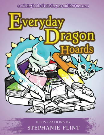
SIFlint Art: My dragon hoards project has now been proofed! It is a coloring book with 24 designs, set to release on June 4th! I’m received my proof copy (which I had to adjust because I accidently missed including two of the designs… but hey, that’s what proofs are for).
More details coming soon! 🐉
Daz PA: I finally finished and submitted my newest pose set, the Infernal Queen poses for Genesis 9. It’s now available at the Daz store! 🔥
Meanwhile, I’m considering enlisting outside help with finishing my Diverse Worlds Genesis 9 morphs set since it would require a considerable amount of time for me to complete the morphs needed to create the required corrective morphs (which may be a lot easier for someone more experienced with character creation to complete.
However, I’m also in the process of training Isaac how to finish pose sets so that we can tag-team on their creation. I’m creating our own personal standard operating procedure/tutorial for reference, and Isaac (who already has experiencing making poses/promos) will start creating products as well. I’ll be acting as the quality assurance to make sure it still matches the required standards before submitting them per usual. (And in the meantime, having that SOP will be useful for keeping me on track as well).
Isaac and I have started doing weekly meetings to stay up-to-date with our progress on both Daz, SIFlint Art, and Infinitas Publishing.
* * *
Happy writing and reading (Or 3D rendering if you’re into Daz)! 🙂
Here’s the Infinitas Publishing updates for the past month and a half(-ish)! 📋
I’ve highlighted the projects that had changes in blue.
* * *
Isaac’s Untitled Fantasy Story: On hold with a rough draft of 58,000 words.
Next up: Finish writing the rough draft for missing scenes, then do a revision pass on the earlier scenes now that I better remember how the magic system works. Once that’s done, this will likely return to being a back-burner project while I finish other projects.
Crafting Your Fictional World (Non-Fic Book): At the moment I have the introduction, two complete chapters, and one complete exercise related to those chapters ready to go, based on the feedback from Isaac. I have another one-to-two chapters partially revised. Unfortunately, I need to fully reorganize this project (which is currently split between Google Docs and Scrivener), and then create a color-coded system for what stage a chapter is in so that I will be better prepared to move forward with the next steps.
I would prefer to have six chapters and their exercises complete before starting the subscription, with the idea that I’d have a six month buffer zone for creating new chapters, as well as using the six month mark to evaluate how the plan is holding up. At a minimum, however, I’d like to have at least three chapters and their exercises complete.
Next up: Organize the chapters in Scrivener, make revisions per Isaac’s suggestions, re-review the chapters, and then upload to Ream.
Sweetweird Genre Notes: On hold with 2,100 words.
Starless Night:(Book 3 of the Distant Horizon series). Blurb needs to be updated across all retailers.
Changing Tides: (Book 4 of the Distant Horizon series). On hold while working on Legends of Cirena #9. Next step is to merge the two revised drafts and start writing the missing scenes.
Betrayed (Deceived #2): I’ve completed the basic ebook formatting, and I’ve started one final proofread/revisions of minor notes. After this is complete, I plan to send this to beta-readers for any remaining feedback, and then set a release date for the ebook.
I’ve also determined that I probably won’t be releasing book #3 on Wattpad (it largely boils down to Betrayed not being the right genre for the platform), but I haven’t yet decided whether to continue releasing it serially on another platform or to return to ebook-only releases.
Next up: Continue revisions to Deceived #3. Add Isaac’s notes from Deceived #5 (formerly #4) into the manuscript, revise Deceived #5, and revise #6 (formerly #5) before handing it to Isaac for his feedback.
TWB 4: (Book Four of The Wishing Blade series). On hold. Next step is to finish adding the remaining outline to Scrivener, review that outline for missing plot points, and then write the rough draft.
Wishing Blade Prequel (Prequel novella for The Wishing Blade): On hold. Next step is to write the rough draft of the new scenes and begin revising the original scenes to match the updated outline.
Once complete, this is intended to be a newsletter-exclusive story.
The Legends of Cirena – Collaborative Adventure Facebook Group:On hiatus.
The Dark Forest of Aneth (“Ro’nor (“The Restless Sands of Neel”) & Zynia (“The Dragons of the Mist”) cross-over / A Legends of Cirena short novel): On hold at 52,000 words. Completing the rough draft is my plan for next month.
Goals: Add the last few scenes and polish. Edit the book cover.
The Wind Mage and the Wolf (“Livena (The Wind Mage of Maijev”) & Nuaka (“The Gryphon and the Mountain Bear”) cross-over / A Legends f Cirena short novel) : Joran’s short story is on hold. Still needs a couple scenes smoothed out, and I need to cross-reference the final scene in TheWind Mage and the Wolf (from Joran’s point of view). After that, it’ll be ready for a read-aloud and proofreading.
Huntress 3:I’ve got the beginnings of a viable outline! 😄 This one has been causing me trouble for a while, and I finally figured out that I’ve been looking at the wrong fairy tales for reference. While this still has a ways to go, I’m happy to report that I’ve started drafting a potential outline and I’ve found some reading material to help me brainstorm ideas for this book.
More importantly… I can finally envision a happy ending, which is kind of important for a romance.
Next up: Reread the first two books, browse relevant reading material, and finish creating a detailed outline.
Game Design: On hold.
Mist Catcher (Isaac’s Sci-Fi Story): On hold. The current draft sits around 111,000 words, (not including the Halloween episode?).
Marketing: I tested a method of promoting BookFunnel promos by creating new banners with covers chosen from the promo, but I continued seeing a low number of clicks. I’ve held off on doing any new promos in March.
On the bright side, I’ve maintained the newsletters, though I’ve been testing adding relevant short stories/flash fiction to them to see if that increases engagement or series interest. It’s too early to analyze the results.
I also continued the usual Amazon drip ads, though I’ve begun monitoring them to see if it’s worth their ad spend. I did create one more ad, very narrowly targetted (and still a drip ad, so it’s inexpensive), and I’m monitoring it to see how it does.
I did a test run of a paid newsletter service that has previously done well for me (about a year ago), but I didn’t see any results this time, so my hypothesis that I might see sells from that has been disproved, which means I’ll hold off on running those promos for the foreseeable future. In the future I may try other paid newsletters, but I’ll need to do more research before deciding which one, if any.
Additionally, business taxes are complete and were sent in prior to March! We also updated several of the Wishing Blade universe ebook prices, and changed our mailbox for newsletter CAN-SPAM compliance purposes, since the previous box we used went up considerably in price.
Next up: Continue adding sample chapters to the BookFunnel pages and the main Infinitas Publishing website, and update my author bio across the different websites. Eventually continue updating Stripe and Payhip so I can offer direct sales from the main website. Update the business ledger on a regular basis. Add a progress tracker somewhere for the different books. Revise Amazon ads, and overhaul book categories, keywords, and blurbs.
Other Stories: I wrote a couple pieces of flash fiction for my newsletters, one from Nsasrar’s point of view (Wishing Blade Universe), one from Pops’ point of view (Distant Horizon Universe), and I’ve started a short story spin-off of The Gryphon and the Mountain Bear. Once I have enough short stories, provided that I continue writing shorts for the newsletter, I eventually hope to collect these into one volume to release as an ebook.
I’ve edited two manuscripts for the next Writers of Warrensburg anthology, and made the first chapter revisions to my manuscript per their feedback. My next step is to finish those revisions and send them in by the end of the month.
Next up: Revise ending of YA Alien Invasion/Dystopian story.
Other on hold projects include: a “for-fun” space/portal fantasy story rough draft, Mermaid/Siren Sci-Fi short story draft, and comic script (“If I Had Asked”).
SBibb’s Photographic Illustration: I’ve mostly completed ebook formatting of my current project, though there’s a few tweaks left to make pending approval. Next up will be paperback formatting.
Future Goals: Figure out a schedule for uploading general art projects. Update the SBibbPhoto website to incorporate Daz work, and fix the SEO information.
SIFlint Art: I’ve continued my dragon hoards line-art project. Goal now is to get enough sketches to create a coloring book. I’m currently at 16 of my 20 minimum (with 24 preferred). Some of those still need to be scanned and cleaned in Photoshop. If all goes well, I’d like to have this project finished by June, but I haven’t set a hard deadline yet.
Additionally, I did a booth mock-up for a potential upcoming event. More on that closer to time.
Daz PA: I’ve almost finished with a new group pose set based on a recently released Daz character. I just need to finish the dials and thumbnails, then edit the promos, and then I’ll submit it.
I temporarily tabled my Diverse Worlds Genesis 9 morphs set since I need to learn a new technique in order to finish them per the QA team. It’s next on my list, but since I wasn’t sure how long it would take, I switched to the pose set.
* * *
Happy writing and reading (Or 3D rendering if you’re into Daz)! 🙂
This past month I did a lot of reading, both fiction and non-fiction. Kind of hard to say what I read, though, as I’ve been hopping a lot from book to book and back again.
Anyhow, here’s the Infinitas Publishing updates!
I’ve highlighted the projects that had changes in blue.
* * *
Isaac’s Untitled Fantasy Story: On hold with a rough draft of 58,000 words.
Next up: Finish writing the rough draft for missing scenes, then do a revision pass on the earlier scenes now that I better remember how the magic system works. Once that’s done, this will likely return to being a back-burner project while I finish other projects.
Crafting Your Fictional World (Non-Fic Book): I’ve now created cover art for this, though it might end up being a placeholder cover for Ream rather than the final ebook version, and I revised enough chapters to be satisfied that I would have six months of content for testing.
So I then did a read-aloud with Isaac…
Only to end up with quite a few more revisions (and chapter ideas) that I need to do before I launch this subscription. Good news is that Isaac’s academia background gave him a lot of ideas of how I could improve the chapters to hopefully be more useful.
I’m no longer looking at the rough draft word count since it’s split into two documents, one on Google Docs which has the general concept chapters, and one in Scrivener which has the more polished chapters (that still need revisions). The Scrivener count currently shows 13,200 words.
Next up: Make revisions per Isaac’s suggestions, re-review the chapters, then upload to Ream.
Sweetweird Genre Notes: On hold with 2,100 words.
Distant Horizon: (Book 1 of the Distant Horizon series): The ebook version of this went to space 🚀 on the Peregrine lunar lander in early January!
While complications with the lander’s fuel intake valve resulted in the mission not going to the moon as planned (the lander instead re-entered Earth’s atmosphere and burned up in re-entry), Distant Horizon and Fractured Skies were both part of the Writer’s on the Moon project that spent a few days in space.
Next up: Paperback version of this in Atticus, which can be used on Draft2Digital in order to release a paperback version wide across multiple retailers, rather than only on Amazon. I intend to revisit the blurb before finalizing this. On hold.
Starless Night:(Book 3 of the Distant Horizon series). Blurb needs to be updated across all retailers.
Changing Tides: (Book 4 of the Distant Horizon series). On hold while working on Legends of Cirena #9. Next step is to merge the two revised drafts and start writing the missing scenes.
The Glitch Saga (Distant Horizon spin-off series): Goal is to create a new cover and print edition for the complete collection edition. (On hold).
Deceived (Distant Horizon spin-off series): Needs print formatting. On hold.
Betrayed (Deceived #2): The last five chapters have been posted to Wattpad, completing the Wattpad postings!
My next step is to do the ebook formatting of this so I can send it to beta-readers for any final feedback, and then set a release date for the ebook.
I’ve also got to decide whether to release book three on Wattpad, or if I want to move it to a different platform, or if I want to continue releasing it serially versus ebook first.
Next up: Continue revisions to Deceived #3. Add Isaac’s notes from Deceived #5 (formerly #4) into the manuscript, revise Deceived #5, and revise #6 (formerly #5) before handing it to Isaac for his feedback.
TWB 4: (Book Four of The Wishing Blade series). On hold. Next step is to finish adding the remaining outline to Scrivener, review that outline for missing plot points, and then write the rough draft.
Wishing Blade Prequel (Prequel novella for The Wishing Blade): On hold. Next step is to write the rough draft of the new scenes and begin revising the original scenes to match the updated outline.
Once complete, this is intended to be a newsletter-exclusive story.
The Legends of Cirena – Collaborative Adventure Facebook Group:On hiatus.
The Dark Forest of Aneth (“Ro’nor (“The Restless Sands of Neel”) & Zynia (“The Dragons of the Mist”) cross-over / A Legends of Cirena short novel): Major progress made here, since this was my primary focus for January. Didn’t quite finish the rough draft, but I did do another round of revisions to what was there, cut a few scenes, added a few scenes, and finally figured out how to complete the plot arc in a way that felt more satisfying.
The draft now sits at 52,000 words (down 4,000 words after cutting several scenes that weren’t working).
Goals: Add the last few scenes and polish. Edit the book cover.
The Wind Mage and the Wolf (“Livena (The Wind Mage of Maijev”) & Nuaka (“The Gryphon and the Mountain Bear”) cross-over / A Legends f Cirena short novel) : Joran’s short story is on hold. Still needs a couple scenes smoothed out, and I need to cross-reference the final scene in TheWind Mage and the Wolf (from Joran’s point of view). After that, it’ll be ready for a read-aloud and proofreading.
The Legends of Cirena Volume One (LoC #1-6 Collection): Technically complete, though there are still a few small tweaks I’d like to make (prettier ellipses). I also plan to update the ebook files of LoC 1-6 for the minor typos as time permits.
Huntress 3:On hold.
Next up: Reread the first two books and create an outline.
Huntress Prequel: On hold at 18,000 words. Needs rough draft completed.
Game Design: On hold.
Mist Catcher (Isaac’s Sci-Fi Story): Isaac reports having added only a little extra to Mist Catcher (plus some plot notes), so I don’t have an updated word count. For now I’m assuming the current draft sits around 111,000 words, (not including the Halloween episode?).
Marketing:
Still had pretty low click counts on the BookFunnel book promos last month, though I started testing a new method of promoting the promo (by creating new banners in Canva with a handful of covers chosen from the promo that I think might appeal to my newsletter and blog readers). I’m going to continue testing that method this month. I do have a few new promos I’ve joined for February, though I still need to set up the blog’s weekly book promo highlights.
Newsletters have largely continued as planned (aside from one accidentally skipped one) in the same format as before, and I also continued the usual Amazon drip ads, though I intend to evaluate them soon to decide whether or not to continue them.
Accounting for last year is now complete, however, and I’m all set to work on business taxes (which I hope to complete by mid-month).
Next up: Continue adding sample chapters to the BookFunnel pages and the main Infinitas Publishing website, and update my author bio across the different websites. Eventually continue updating Stripe and Payhip so I can offer direct sales from the main website. Update the business ledger on a regular basis. Add a progress tracker somewhere for the different books. Revise Amazon ads, and overhaul book categories, keywords, and blurbs.
Other Stories: No new updates on my end, though I’ve received the manuscripts I’m going to edit for the next Writers of Warrensburg anthology, as well as the first edited version of my manuscript, which I’ll be focusing on in February.
Next up: Revise ending of YA Alien Invasion/Dystopian story.
Other on hold projects include: a “for-fun” space/portal fantasy story rough draft, Mermaid/Siren Sci-Fi short story draft, and comic script (“If I Had Asked”).
Unofficial Minecraft FanFic: On hold.
SBibb’s Photographic Illustration: On hold. I do have a new formatting project I intend to work on during February.
Future Goals: Figure out a schedule for uploading general art projects. Update the SBibbPhoto website to incorporate Daz work, and fix the SEO information.
SIFlint Art: No new updates here, aside from some general for-fun artsy practice and drawings.
Daz PA: No updates here, though I plan to update my Diverse Worlds Genesis 9 morphs set per quality control feedback during February. Did a little beta-testing for an undisclosed side project, but I’m currently leaning away from getting more involved with that project.
* * *
Happy writing and reading (Or 3D rendering if you’re into Daz)! 🙂
I’ve highlighted the projects that had changes in blue.
* * *
Isaac’s Untitled Fantasy Story: On hold with a rough draft of 58,000 words.
Next up: Finish writing the rough draft for missing scenes, then do a revision pass on the earlier scenes now that I better remember how the magic system works. Once that’s done, this will likely return to being a back-burner project while I finish other projects.
Crafting Your Fictional World (Non-Fic Book): A small update to this: I drafted another worksheet for one of the chapters. I also did a little more work on Ream to start setting up the subscription option. Rough draft sitting at 22,000 words.
Next up: Create cover art for the book/Ream (which means doing a bit of non-fic cover research) and then revising enough chapters to have at least half a year’s worth of content for scheduling.
Sweetweird Genre Notes: On hold with 2,100 words.
Distant Horizon: (Book 1 of the Distant Horizon series): Next up: Paperback version of this in Atticus, which can be used on Draft2Digital in order to release a paperback version wide across multiple retailers, rather than only on Amazon. I intend to revisit the blurb before finalizing this. On hold.
Starless Night:(Book 3 of the Distant Horizon series). Blurb needs to be updated across all retailers.
Changing Tides: (Book 4 of the Distant Horizon series). On hold while working on Legends of Cirena #9. Next step is to merge the two revised drafts and start writing the missing scenes.
The Glitch Saga (Distant Horizon spin-off series): Goal is to create a new cover and print edition for the complete collection edition. (On hold).
Deceived (Distant Horizon spin-off series): Needs print formatting. On hold.
Betrayed (Deceived #2): So far, fourteen chapters have been posted to Wattpad (up from nine chapters last time). I still need to schedule the final chapter, which is set up aside from the note detailing what’s coming next for the series. The reason is that I want to note what’s coming next… whether I’ll be releasing book three via Wattpad as well and, if so, how long of a wait to expect.
Next up: Send this draft to beta-readers so I can start preparing for the ebook release. Continue revisions to Deceived #3. Add Isaac’s notes from Deceived #5 (formerly #4) into the manuscript, revise Deceived #5, and revise #6 (formerly #5) before handing it to Isaac for his feedback.
TWB 4: (Book Four of The Wishing Blade series). On hold. Next step is to finish adding the remaining outline to Scrivener, review that outline for missing plot points, and then write the rough draft.
Wishing Blade Prequel (Prequel novella for The Wishing Blade): On hold. Next step is to write the rough draft of the new scenes and begin revising the original scenes to match the updated outline.
Once complete, this is intended to be a newsletter-exclusive story.
The Legends of Cirena – Collaborative Adventure Facebook Group:On hiatus.
The Dark Forest of Aneth (“Ro’nor (“The Restless Sands of Neel”) & Zynia (“The Dragons of the Mist”) cross-over / A Legends of Cirena short novel): On hold with a draft (both polished and rough sections) at 56,000 words.
Goals: Finish rough draft and polish. Edit the book cover.
The Wind Mage and the Wolf (“Livena (The Wind Mage of Maijev”) & Nuaka (“The Gryphon and the Mountain Bear”) cross-over / A Legends f Cirena short novel) : Joran’s short story is on hold. Still needs a couple scenes smoothed out, and I need to cross-reference the final scene in TheWind Mage and the Wolf (from Joran’s point of view). After that, it’ll be ready for a read-aloud and proofreading.
The Legends of Cirena Volume One (LoC #1-6 Collection): Upon reading the print edition, I discovered that I’d somehow managed to remove ellipses from two chapters of The Cursed Halls of Kalecen. I prioritized getting those added back into the print edition (and fixing a few other typos).
The updated file is now uploaded to KDP. There are still a few small tweaks I’d like to make (I learned how to make the ellipses look better in Atticus while getting them added back in) but that will be a side project for later. I also plan to update the ebook files of LoC 1-6 for the minor typos found, so that’s also on my radar as time permits.
Huntress 3:On hold.
Next up: Reread the first two books and create an outline.
Huntress Prequel: On hold at 18,000 words. Needs rough draft completed.
Game Design: On hold.
Mist Catcher (Isaac’s Sci-Fi Story): Isaac added an extra 1,300 words, leaving the current draft at 110,700 words, (not including the Halloween episode?).
Marketing:
I did join a few BookFunnel promos last month, and I included the blog’s book promo highlights. That said, I’ve noticed a low number of clicks on my end (especially since I stopped posting on Twitter/X because I was concerned I was only getting bot clicks), so I’m worried that I’m not providing as much value to the promo on my end. I do have one promo scheduled for January, but I need to re-evaluate these to see if there’s a better way for me to use them.
I did resume newsletters as planned, and I’ve been evaluating if there are any changes I’d like to make to the format of those. Amazon drip ads continued as well.
Next up: Continue adding sample chapters to the BookFunnel pages and the main Infinitas Publishing website, and update my author bio across the different websites. Eventually continue updating Stripe and Payhip so I can offer direct sales from the main website. Update the business ledger on a regular basis. Add a progress tracker somewhere for the different books. Revise Amazon ads, and overhaul book categories, keywords, and blurbs.
Other Stories: Despite very last minute procrastination, I managed to write a rough draft for my Writers of Warrensburg anthology, revise it, run it through ProWritingAid for edits, and then read it aloud with Isaac for a final polish before submitting it on the final day before the deadline.
Yay for outlines!
Next for that project is waiting to receive the manuscript swap for editing other submissions.
Next up: Revise ending of YA Alien Invasion/Dystopian story.
Other on hold projects include: a “for-fun” space/portal fantasy story rough draft, Mermaid/Siren Sci-Fi short story draft, and comic script (“If I Had Asked”).
Unofficial Minecraft FanFic: On hold.
SBibb’s Photographic Illustration: On hold.
Future Goals: Figure out a schedule for uploading general art projects. Update the SBibbPhoto website to incorporate Daz work, and fix the SEO information.
SIFlint Art: Pencil bags have arrived! Aside from being a little darker than expected, they came out nicely, I think. We’ve been selling them at our local comic/book shop, Black Ice.
The pencil bags arrived!
Additionally, I managed to get one submission made for the Poorly Drawn Pets fundraiser for the Copper Country Humane Society.
Daz PA: I finalized my Diverse Worlds Genesis 9 morphs set and submitted it, but I did receive some feedback notes for changes that need to be made, so that’s my next step.
* * *
Happy writing and reading (Or 3D rendering if you’re into Daz)! 🙂
⏰ Time for another Infinitas Publishing status report! 😊
I’ve highlighted the projects that had changes in blue.
* * *
Isaac’s Untitled Fantasy Story: So… this was a backburner project as of a month ago, but I needed something that was already outlined for NaNo, so I snagged it to work on last month. (More about that change of plans here). I ended up writing 58,000 words for NaNoWriMo, and managed to keep up with par daily. Now I’m taking a break from writing for a few days, because that was exhausting while also trying to keep up with my evening shift at the library and preparing for the Poor Artist Sale. But… now there’s a good chunk of rough draft ready to go!
Next goal with this will likely be to finish writing the rough draft for any missing scenes, then do a revision pass on the earlier scenes now that I better remember how the magic system works. Once that’s done, this will likely return to being a back-burner project while I finish other projects.
Crafting Your Fictional World (Non-Fic Book): Rough draft sitting at 22,000 words. On hold.
Sweetweird Genre Notes: On hold with 2,100 words.
Distant Horizon: (Book 1 of the Distant Horizon series): Next up: Paperback version of this in Atticus, which can be used on Draft2Digital in order to release a paperback version wide across multiple retailers, rather than only on Amazon. I intend to revisit the blurb before finalizing this. On hold.
Starless Night:(Book 3 of the Distant Horizon series). Blurb needs to be updated across all retailers.
Changing Tides: (Book 4 of the Distant Horizon series). On hold while working on Legends of Cirena #9. Next step is to merge the two revised drafts and start writing the missing scenes.
The Glitch Saga (Distant Horizon spin-off series): Goal is to create a new cover and print edition for the complete collection edition. (On hold).
Deceived (Distant Horizon spin-off series): Needs print formatting. On hold.
Betrayed (Deceived #2): We’re now up to chapter nine on Wattpad! All episodes have been scheduled both for the newsletter and on Wattpad, with the exception of the final chapter. The reason is that I’d like to have a note with what’s coming next, and when, and that is still to be determined.
As it currently stands, this draft of Betrayed is set to be fully released on Wattpad in early February.
My next step is to send this draft to beta-readers so I can start preparing for the ebook release.
Future Goals: Continue revisions to Deceived #3. Add Isaac’s notes from Deceived #5 (formerly #4) into the manuscript, revise Deceived #5, and revise #6 (formerly #5) before handing it to Isaac for his feedback.
TWB 4: (Book Four of The Wishing Blade series). On hold. Next step is to finish adding the remaining outline to Scrivener, review that outline for missing plot points, and then write the rough draft.
Wishing Blade Prequel (Prequel novella for The Wishing Blade): On hold. Next step is to write the rough draft of the new scenes and begin revising the original scenes to match the updated outline.
Once complete, this is intended to be a newsletter-exclusive story.
The Legends of Cirena – Collaborative Adventure Facebook Group:On hiatus.
The Dark Forest of Aneth (“Ro’nor (“The Restless Sands of Neel”) & Zynia (“The Dragons of the Mist”) cross-over / A Legends of Cirena short novel): On hold for NaNoWriMo, with a draft (both polished and rough sections) at 56,000 words.
Goals: Finish rough draft and polish. Edit the book cover.
The Wind Mage and the Wolf (“Livena (The Wind Mage of Maijev”) & Nuaka (“The Gryphon and the Mountain Bear”) cross-over / A Legends f Cirena short novel) : Joran’s short story is on hold. Still needs a couple scenes smoothed out, and I need to cross-reference the final scene in TheWind Mage and the Wolf (from Joran’s point of view). After that, it’ll be ready for a read-aloud and proofreading.
The Legends of Cirena Volume One (LoC #1-6 Collection): Print edition complete! I got the last chapter background illustrated, added in illustrations (both new and ones created for the Wishing Blade Universe newsletter), and finalized the formatting and cover.
There are a few minor tweaks I may make to the print edition before moving on from this completely, but I won’t make those changes until I have a chance to reread through the print edition (one last round of searching for typos, plus a reminder for any edits I need to make to LoC #9).
Huntress 3:On hold. Still planning on rereading the first two books and creating an outline. This might be a December project, though I primarily plan to use December for wrapping up small this-and-that projects.
Huntress Prequel: On hold at 18,000 words. Needs rough draft completed.
Game Design: On hold.
Mist Catcher (Isaac’s Sci-Fi Story): Last time this was at 46,600 words (including some notes). However, this was Isaac’s NaNoWriMo project, and he wrapped up the month with a whopping new 62, 845 words. 🎉
From what I can tell, that puts his latest draft at 109,400 words (not including the Halloween episode?)
Aside from taking a break after NaNo, I think his goal is to complete the series arc, which would complete the draft.
Marketing:
The Poor Artist Sale went well. Though we didn’t quite hit my target goal in sales, we got really close, and we did better than last year. 😁 And, aside from a rough start with setup (let’s just say that setting up the canopy with lights took longer than expected(, we were both happy with the final result.
We shared the booth with Lillie Rae Art, who had stickers and jewelry on their side (my favorite being the cat themed-bubble tea pin, and Isaac’s favorite being the little rainbow ghost pin).
Again, no new BookFunnel promos last month, though December is fully set up to have weekly book promo highlights. 🙂 I also plan to resume newsletters in December. Amazon drip ads continued as usual.
Next up: Continue adding sample chapters to the BookFunnel pages and the main Infinitas Publishing website, and update my author bio across the different websites. I finally remembered that my plan for Stripe and Payhip was to offer direct sales from the main website. Update the business ledger on a regular basis. Add a progress tracker somewhere for the different books. Revise Amazon ads, and overhaul book categories, keywords, and blurbs.
Other Stories: On hold
Next up: Draft my next Writers of Warrensburg anthology short story. Revise ending of YA Alien Invasion/Dystopian story.
Other on hold projects include: a “for-fun” space/portal fantasy story rough draft, Mermaid/Siren Sci-Fi short story draft, and comic script (“If I Had Asked”).
Unofficial Minecraft FanFic: On hold.
SBibb’s Photographic Illustration: On hold.
Future Goals: Figure out a schedule for uploading general art projects. Update the SBibbPhoto website to incorporate Daz work, and fix the SEO information.
SIFlint Art: Pencil bags have been ordered (we did three designs… the Legends of Cirena era map, my nonbinary book dragon, and Isaac’s Celestial Tides dolphins in space), but they didn’t come in on time for the Poor Artists Sale.
We had also tossed around the idea of doing a coloring book with my Dragon Hoard designs, but didn’t have enough designs yet for that, so we instead printed coloring postcards through the local The Print Shop store. We printed nine designs, and created bundles of eighteen postcards (two of each design) with an eight-pack of crayons. (I ordered 43 packs of crayons from Michaels, whee!). We did sell those at the Poor Artist Sale.
Daz PA: I’ve finished the main shapes for the Genesis 9 version of my Diverse Worlds Head morphs set for 200 Plus Head and Face Morphs. All that’s left is to finalize the set, which I plan to prioritize now that NaNoWriMo is over.
* * *
Happy writing and reading (Or 3D rendering if you’re into Daz)! 🙂
It’s been a while since I’ve uploaded a video blog post, but I received my print copies of “Stone and String” today (a day early!) and wanted to do the unboxing. So I’ve got a quick announcement about the Infinitas Publishing booth at Burg Fest, the upcoming dates regarding Distant Horizon, and the first look at the print copies of “Stone and String.” Check out the video below, and I hope you enjoy it. 🙂
A cover for Cave Hollow Press. For this cover, they wanted to incorporate elements of Edgar Allen Poe’s work and a feeling of a mystery. We settled on a raven and a locket (the locket plays an important role in the story) and we used the codec from inside the book (provided by the author) for the background. We went for red and black colors to add to the mysterious look, and I chose a cob-webby font that would add to the eerie mystery and work well for middle grade fiction.
I also did a wrap-around print cover. However, knowing that the primary form would be paperback–and knowing that CMYK does not play well with red– I created this cover first in CMYK (a smaller color space), and then converted it to sRGB for the online editions.
Something important to keep in mind when working with print editions is that if you download a template from Createspace, that template is in sRGB. You will need to convert it to CMYK prior to moving the image over for a wrap-around cover… or potentially need to redo portions of the image. (This is mostly a problem if you have a heavy amount of red on the cover.)
Another trick I found for getting the red color to work well in CMYK is to create a layer of red color based on the title (Hex Code: E32E24), overlaying it across all red portions of the cover (I masked out the locket and publisher logo), and the lowering the opacity to 30%. (I use Adobe Photoshop CS6). I’d read an article that suggested that CMYK does better with “pure” colors, and by adding the red overlay, that made the colors seem more “pure” for its color space.
I also did the interior formatting. You can check that out using the “look inside” feature on Amazon. 🙂