

This is a cover I did for Liquid Amber Publishing. Initially, they were looking for formatting of the print edition (since she had the kindle version ready), and since I’ve had some experience with formatting books for my own purposes, I agreed to the job. I had a lot of fun examining other books in the genre to try to emulate the style of formatting as best I could, and it’s something I recommend doing if you plan to format your own book. Pay attention to how chapter headings start (like those first lines… is the first letter of the first sentence a drop cap? Is the whole sentence capitalized? Italicized?), and how the chapters are numbered or headed. Look out for orphaned words and sentences at the end of the chapter that land on an otherwise blank page. See if chapters always start on an odd page, if they continue immediately after the previous chapter left off, or on the next page. Check that your numbers and headings are centered (especially where the ruler wants to indent everything). Make sure your table of contents, if you have one, matches up to the correct pages. If you’re using Microsoft Word, learn how to use styles. (This saves quite a bit of time in the long run. I recommend reading Smashwords’ formatting guide to pick up on the basics of simple ebook formatting, which can save time in print formatting, as well). Check for “rivers” of blank space running across the page. Decide (by printing out test sheets), the size of the font and how much space you want between the lines. It’s not necessarily best to go with single or double-space, and you can individually set paragraphs in Word. In some cases, I shortened a cluster of paragraphs on a single page in order to keep a section break from looking unwieldy on the second or third line of a page.
Side note: Having Adobe Acrobat Pro (I have version 9) is seriously helpful when converting a word document to a PDF that Createspace will recognize. I found this link to be fairly helpful in regards to PDF conversion: https://forums.createspace.com/en/community/docs/DOC-1331
As for the cover, they wanted something that resembled the cover for the ebook edition, but since that same cover wasn’t available for print, we opted to try something slightly different. This is what we came up with:
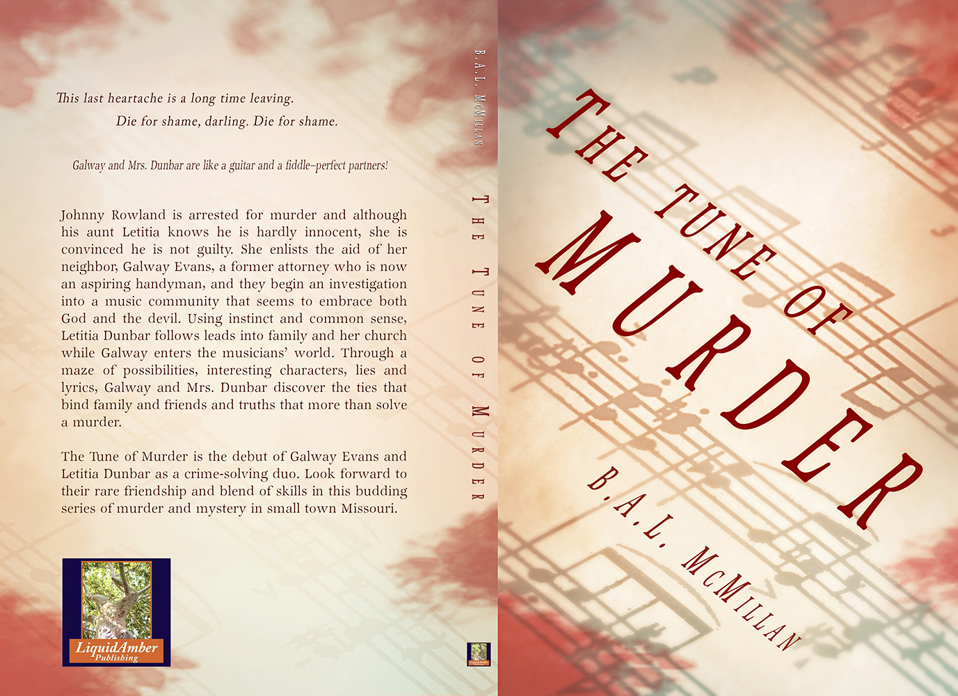
Stock photo from Dreamstime:
http://www.dreamstime.com/stock-image-candle-illuminates-music-paper-image22544191


I am looking forward to reading this book, it in a genre I enjoy, and I love the cover.
Awesome. I hope you enjoy it. I haven’t read it personally (not my preferred genre for reading), but I had fun doing the formatting and creating the cover for it. 🙂