Tag Archives: createspace

Book Formatting Services Now Available!

I mentioned yesterday that I was going to start offering formatting services soon. I now have that information gathered in one place… my Interior Book Design page! I’ve also updated the prices on my Book Cover Design page.

So, if you’re interested in having your book formatted for Smashwords, Kindle, and/or Createspace, here’s a list of the services I provide. 🙂


* * *

Ebook (Basic Formatting)

What I do: I clean the file of stray formatting and make the file compliant for both Kindle and Smashwords. Allows for one-to-five images, as provided by the author. I can insert a basic copyright page if needed. I also insert a table of contents and hyperlinks, where appropriate.

Cost:

$50.00 for up to 50,000 words

$75.00 for up to 100,000 words

What you get: .doc file for Smashwords and a ZIP file for Kindle (or .doc, if there are no images inside the file).

I allow for 1 round of cost-free corrections to be made after the file has been approved (this is to allow for proofing), as long as the corrections are requested within two months of the original approval of the project.  Note, for 50,000 word projects, I cap the amount of time put into corrections at 1.5 hours. For 100,000 words projects, the cap is 3 hours. After that, additional corrections during the first round will be $10.00 an hour. After the first round, corrections will be made at a rate of $15.00 an hour. For this reason, please provide the file that is closest to what your final product will be.

(Corrections made that are due to my errors will be made free of charge, so long as the corrections are requested within two months of the project’s approval date).

*

EBook (Decorative Formatting)

What I do: Same as Basic Formatting, but stylized chapter headings are available and I can insert glyphs for section breaks. Exact details will depend on the book and its genre.

This includes the creation of 1 glyph (a stock image may need to be purchased, or I may design the glyph myself. You’ll have a chance to approve the design). Alternatively, you may provide the glyph. It also includes chapter headings and title text that have been stylized in a font appropriate for your book. (Again, you’ll have a chance to approve the design). Please note that I do not embed the font–I use images to ensure that the headings will be visible on multiple e-readers.

This option also allows for the insertion of 1 – 10 images, as provided by the author.

Cost:

$125.00 for up to 50,000 words

$175.00 for up to 100,000 words

What you get: .doc file for Smashwords and ZIP file for Kindle.

Examples:

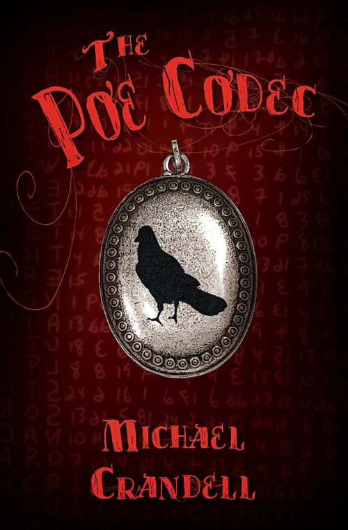
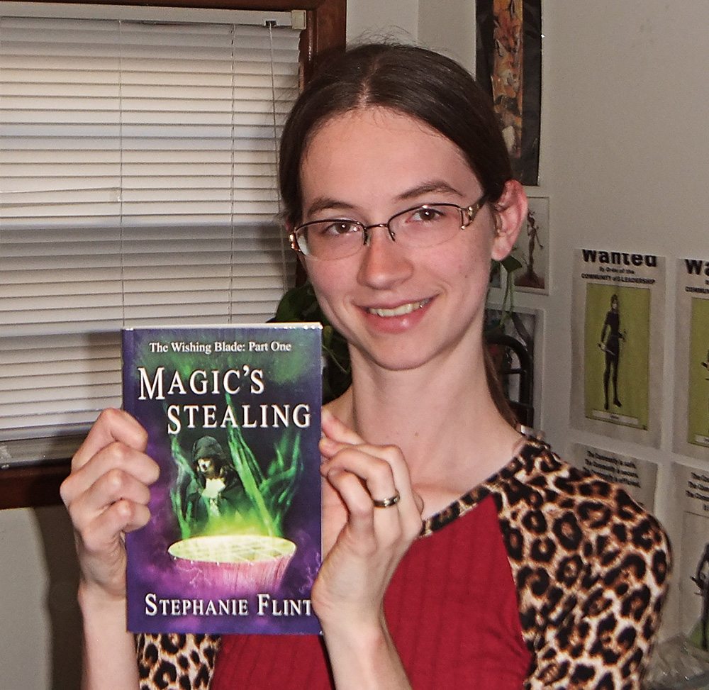
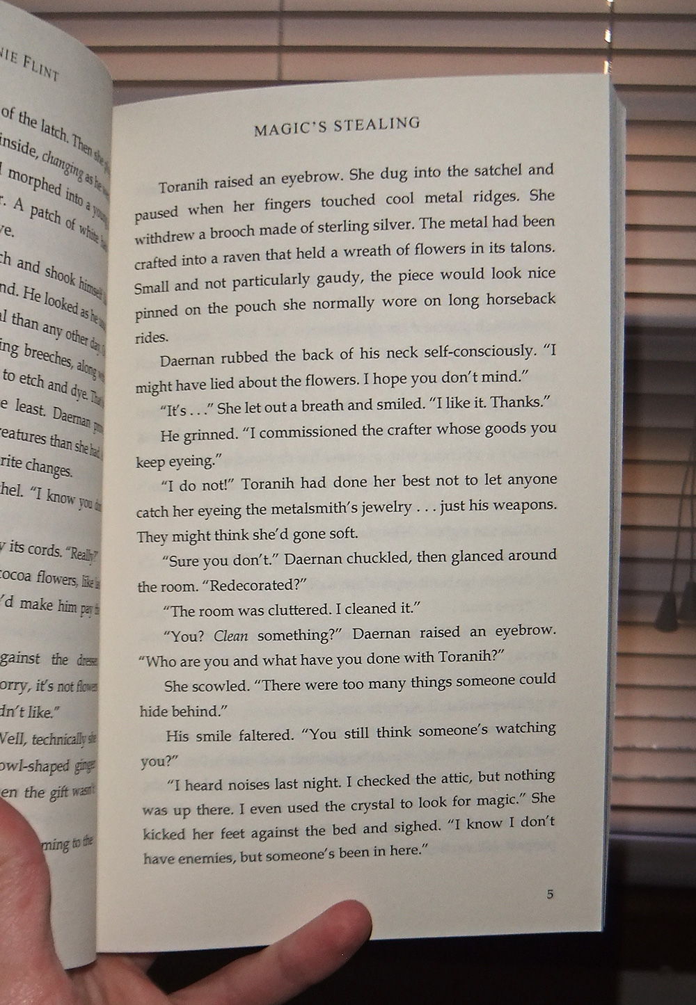
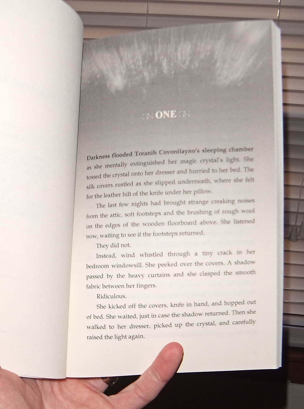
Distant Horizon, Magic’s Stealing, The Poe Codec, M.O.B. (Mean Old Bastard)

*

Print and EBook Formatting

What I do: Same as Decorative Ebook formatting, except that I also prepare a print edition for Createspace or Ingram Spark.  Because the process I use to format the file for a print book starts with the ebook file, the ebook files come with the print formatting.

Note: If I have created the cover of the book (separate cost–email me for information), I may be able to design a specialty chapter background page and/or title page based specifically on the cover.

Cost:

$250.00 for up to 50,000 words

$300.00 for up to 100,000 words

What you get: .doc file for Smashwords, ZIP file for Kindle, and PDF file for Createspace or Ingram Spark (Please specify which–additional costs apply when formatting a manuscript for both printers).

Examples:

Magic’s StealingDistant Horizon, The Poe Codec

*

Cleaned-Up Maps

If you have a sketch of a map that you would like included in your book, but need the file cleaned up, I can provide a cleaner version.

Cost: starts at $25.00 and goes up based on complexity. Contact me for a quote on your anticipated project.

What you get: JPG file suitable for ebook and print editions. You don’t have to use my other services to have this done.

Examples: 

(Click the “Look Inside” option, then go back a couple pages to see the maps.)

Show Me the Sinister Snowman – This is an example of maps where I took the basic sketch and made a completely digital version.

Magic’s Stealing – This is an example of a map that I took the pencil version and retouched in Photoshop, then added in the lettering

*

.Doc to PDF Conversion

What I do: I take the file you send me (Note: You assume responsibility for having the rights to file to make this conversion) and I convert it into a PDF file. This is helpful if you want to do print edition formatting yourself, but don’t have the program necessary to make the PDF conversion.

Cost:

$25.00 per file

(Note: If you have multiple files that need converting, email me to get a quote for a lower price per file).

What you get: A PDF file in the specifications you provide.

If there are errors uploading, and the fault is mine, I will reconvert the file at no additional cost to you. Otherwise, I allow for three conversions of the same file within a two month period (to allow for proofing, etc) before the same cost applies.

* * *

Interested in one of these services?

Contact me at: bookcovers (at) sbibbphoto.com

Leave a comment

Filed under Book Covers, Business Ventures, Writing

Behind the Scenes – The Poe Codec

A cover for Cave Hollow Press. For this cover, they wanted to incorporate elements of Edgar Allen Poe’s work and a feeling of a mystery. We settled on a raven and a locket (the locket plays an important role in the story) and we used the codec from inside the book (provided by the author) for the background. We went for red and black colors to add to the mysterious look, and I chose a cob-webby font that would add to the eerie mystery and work well for middle grade fiction.

I also did a wrap-around print cover. However, knowing that the primary form would be paperback–and knowing that CMYK does not play well with red– I created this cover first in CMYK (a smaller color space), and then converted it to sRGB for the online editions.

Something important to keep in mind when working with print editions is that if you download a template from Createspace, that template is in sRGB. You will need to convert it to CMYK prior to moving the image over for a wrap-around cover… or potentially need to redo portions of the image. (This is mostly a problem if you have a heavy amount of red on the cover.)

Another trick I found for getting the red color to work well in CMYK is to create a layer of red color based on the title (Hex Code: E32E24), overlaying it across all red portions of the cover (I masked out the locket and publisher logo), and the lowering the opacity to 30%. (I use Adobe Photoshop CS6). I’d read an article that suggested that CMYK does better with “pure” colors, and by adding the red overlay, that made the colors seem more “pure” for its color space.

I also did the interior formatting. You can check that out using the “look inside” feature on Amazon. 🙂

This is the end result:

Behind the Scenes - The Poe Codec

Behind the Scenes - The Poe Codec - Wraparound Cover


Stock images from Dreamstime:

http://www.dreamstime.com/stock-photo-raven-image36339410 – raven
http://www.dreamstime.com/stock-images-remembrance-image28935144 – locket

Code picture provided by the author.

Leave a comment

Filed under Book Covers, Client Work

Thoughts on Publishing – Magic’s Stealing – The Paperback Proof Is In!

Today I’m going to interrupt my usual post with an announcement: I have received my paperback proof of Magic’s Stealing!

It came in a small, cardboard wrap (not quite a box, but not a bag, either), and was delivered to my front door. Upon opening the package, I took a few pictures. 😀

SBibb - MS Proof(( Please ignore the various HeroMachine pictures and cool artwork in the background… those aren’t our personal works (Though if you want a good way to organize the general look of your characters, HeroMachine is quite fun. There’s a whole row of pictures off the frame that we based on one of our campaigns). ))

SBibb---MSproof2

Fancy Title Page

Anyway, this book has 158 pages of content, plus additional pages for the front and back matter, and it clocks in at 170 pages long. Here you can see the the title page (there’s a few pages before it), and further down this post are samples of a chapter page and a regular, full-text page. You can click the images to see them at a larger size.

I did all the formatting in Microsoft Word 2007, and I hope to do a post later on some of the fun tools you can use to add a professional touch to your books. Once I tested a few pages out on my printer for various fonts and sizes and line spacing, I saved this as a PDF, and checked it in the digital proofer on Createspace. Once that looked good, I ordered the print edition.

This particular book is 5.25 x 8 inches (based on a few of my favorite books with easy-to-read formatting), which uses the same dimensions as a 6 x 9, so the cover converted easily. Glossy cover and black-and-white, cream pages. I chose the “bleed” option so that I could use the full page image treatment (pulled from the background of the cover) for the chapter intros and title page.

SBibb---MSproof3

Page Full of Text

I did notice that the words got a tad bit close to the gutter, so that’s something I’ll have to keep in mind for future series, but it’s still readable. Of course, I also justified the text.

This is the end result, and I’m now reading through the book to make sure the formatting is correct before I release the print edition (Amazon only, for now).

I’ve found a couple typos, which I’ve made note of, but if those are all I find, I will most likely let those slide for now so that I don’t potentially mess up the formatting right before ordering a large number of books. If I find a large number of typos, I may go ahead and do the initial revision now.

Though that one I’ve found may keep pestering me…

I don’t know. Maybe I’ll order a second proof, that way I can be sure the formatting looks right and that there are as few errors in the print book as possible.

Anyway, regardless of what I choose to do, I plan to go back and revisit both the print and ebook editions at some point for typos, but I’m considering doing that all at once, when more typos have inevitably been found.

In the meantime, look forward to the paperback edition, coming soon! 😀

SBibb---MSproof4

Sorry, this photo got a little blurry…

I hope you’ve found this post helpful. 🙂

Have you had any experiences with proofing a print edition of your book? How do you decide when to update for typo corrections?


 SBibb --- MS Proof  SBibb---MSproof5 

6 Comments

Filed under Book Covers, Business Ventures, Writing

Formatting Print Books – and Behind the Scenes – The Tune of Murder

SBibb - The Tune of Murder - Wrap-around Cover

This is a cover I did for Liquid Amber Publishing. Initially, they were looking for formatting of the print edition (since she had the kindle version ready), and since I’ve had some experience with formatting books for my own purposes, I agreed to the job. I had a lot of fun examining other books in the genre to try to emulate the style of formatting as best I could, and it’s something I recommend doing if you plan to format your own book. Pay attention to how chapter headings start (like those first lines… is the first letter of the first sentence a drop cap? Is the whole sentence capitalized? Italicized?), and how the chapters are numbered or headed. Look out for orphaned words and sentences at the end of the chapter that land on an otherwise blank page. See if chapters always start on an odd page, if they continue immediately after the previous chapter left off, or on the next page. Check that your numbers and headings are centered (especially where the ruler wants to indent everything). Make sure your table of contents, if you have one, matches up to the correct pages. If you’re using Microsoft Word, learn how to use styles. (This saves quite a bit of time in the long run. I recommend reading Smashwords’ formatting guide to pick up on the basics of simple ebook formatting, which can save time in print formatting, as well). Check for “rivers” of blank space running across the page. Decide (by printing out test sheets), the size of the font and how much space you want between the lines. It’s not necessarily best to go with single or double-space, and you can individually set paragraphs in Word. In some cases, I shortened a cluster of paragraphs on a single page in order to keep a section break from looking unwieldy on the second or third line of a page.

Side note: Having Adobe Acrobat Pro (I have version 9) is seriously helpful when converting a word document to a PDF that Createspace will recognize. I found this link to be fairly helpful in regards to PDF conversion: https://forums.createspace.com/en/community/docs/DOC-1331

As for the cover, they wanted something that resembled the cover for the ebook edition, but since that same cover wasn’t available for print, we opted to try something slightly different. This is what we came up with:

SBibb - The Tune of Murder - Cover

Stock photo from Dreamstime:

http://www.dreamstime.com/stock-image-candle-illuminates-music-paper-image22544191

2 Comments

Filed under Book Covers, Client Work, Photo Illustration

“1000 Words” – Now Available in Paperback

Well, the good news is: It’s here. My Honors College Project is done. Turned in. Complete.

Yay. 🙂

Formally titled “1000 Words: A Collection of Short Stories,” is is now available on Amazon. I even fixed the description’s HTML so that it used line breaks. (Though it looks like I’ll have to independently set up the “search inside” feature for the paperback book).

http://www.amazon.com/1000-Words-Collection-Short-Stories/dp/1475227477/ref=sr_1_1?ie=UTF8&qid=1335566292&sr=8-1

Gotta admit, the cool thing is that while I was showing a copy of the printed book to my mentor for the project, a few of the other photo students got a chance to look at it and seemed impressed. Plus, one of the staff who works there decided to buy my book, making him the first official buyer of the paperback edition. Yay! My fiance has first dibs on the ebook edition. LOL 🙂

So now, here’s the part that may or may not be helpful for those of you reading my posts. I’ve taken pictures of the printed book (The Honors College permitted me to buy ten of them, one first myself, one for my mentor, and one for each of the seven models), at different angles. It’s a 6×9 inch paperback book from CreateSpace (they do print-on-demand, or “POD” printing) at 72 pages.

I’ll say one thing. It may be small, but I’m impressed with the interior color printing. The text is crisp, and the colors from the images don’t appear to smudge. The inner covers look great. I might have been a little off on how the spine was supposed to look, but it looks like the guides were correct (once I made a PSD to work from) for the wraparound cover. The paper for the front cover feels a little thin (as opposed to the paper a book printed at Lulu used for the cover) but the quality of the image looks great.

The paper pages are a bright white, but easy to read. I would personally consider extending the gutters out a bit or changing how I typeset the text in word, because the sentence feels a bit short when I try to read a paragraph, but that’s something I personally can do better to improve.

The pages open easily but do not lay flat (I felt a bit concerned about how thin the book is, but the binding appears to be holding).

Now, on to the pictures. 🙂

Front Cover:

SBibb - "1000 Words" Printed Book

Back Cover:

SBibb - "1000 Words" Printed Book

Side View:

SBibb - "1000 Words" Printed Book

Side View:

SBibb - "1000 Words" Printed Book

Inner Pages:

SBibb - "1000 Words" Printed Book

Text Page:

SBibb - "1000 Words" Printed Book

Cover Page:

SBibb - "1000 Words" Printed Book

4 Comments

Filed under Book Covers, Business Ventures, Writing

Updated Website and “1000 Words” Paperback Edition

Last night I uploaded the updated version of my website, http://www.sbibbphoto.com . Now it is split into two sections, Portrait and Event Photography, for the more traditional side of things, and Photographic Illustration and Book Cover Design for my illustrative work. Luckily it only took a couple days to really tweak and update it, but as I’m looking at it, I wonder if my blog and DeviantArt account may be better suited to showing off my work. They’re both easy to update, and you can see the pictures at a much larger size.

Which brings up the question, how large of a size do potential clients want to see images? I already know that I need to update the background for the portrait section of the website, (and tweak the splash page), but I wonder if it might be better to redo the style entirely. My fiance brought up a good point; it’d be a good idea to show both my stronger traditional portraits, as well as my illustrative ones. I know it’s going to take a while to get my book cover design business going. So even though my professors generally say, “Show what you want to sell,” perhaps it’d be a good idea to show both for the time being.

At least until the book cover design business takes off.

And if nothing else, the website works as a good hub for connecting all the different sites I frequent together.

Meanwhile, on the topic of “1000 Words,” I’ve gone into Createspace to set up pricing, and came in for a bit of a sticker shock. Keep in mind, I can order these books for myself for about $6.00. I planned on adding a couple dollars for personal royalties, thus putting it around $8.00. Still kind of pricy, but not necessarilly horrible for a full color book. But with the way the royalties are set up, the minimum I can sell it for is $9.80-something, and that’s not counting royalties on Amazon. My only guess is that it might be for shipping? If I want to make $2.00 off each book on Amazon, I’d be selling it for near $12.00.

Personally, if I was considering buying a paperback for myself, I’m not sure that’d be worth it, for any book that size.

So now I’m trying to decide if I should actually try selling it in paperback version. I suspect that once shipping costs are added in, I wouldn’t do much better trying to sell it myself (unless I was selling it by hand). I probably will upload a paperback version, so it’s there, but I’ll definitly recommend going for the ebook version, if all you want is the stories. (Now if you want your own, personal, handheld copy with all its cool formatting, by all means, go for the paperback version).

But it looks like I won’t be able to sell the paperbacks for under $10.00, like I’d originally planned. Either way, I plan to release it this Friday.

It does bring up one problem that self-publishers have trying to sell thier books, though. Being price-competitive has its complications.

4 Comments

Filed under Book Covers, Business Ventures, Writing

Self-Publishing “1000 Words” – Ebook Anthology Now Available

Well, the good news is in! “1000 Words: A Collection of Short Stories” is now available as an ebook on Smashwords, and soon to be available on Kindle. 🙂

https://www.smashwords.com/books/view/154613

Here’s the cover reveal (went through a couple transformations, but this is by far the one I like best. Yay for a “Twilight Zone” feeling):

SBibb - 1000 Words Cover

Overall, converting it into an ebook wasn’t so hard. Mostly just time consuming, and tweaking things here and there (I’m pretty sure there’s still a couple issues with the Smashwords format, but I’m not sure what). Once I had the Smashwords one done, converting it to a Kindle ebook didn’t take long. Unfortunately, you don’t get all the neat layout designs of  a print book, but the content and images are the same.

It’s available for $2.99, and comes with one additional short story not available for free (unlike the other nine stories in it). I will soon be making a print edition available through Createspace, and the price is to be determined.

I’m considering offering formatting services for both print and ebook editions for self-published authors if this goes well, so let me know what you think. 🙂

4 Comments

Filed under Book Covers, Business Ventures, Writing

Self-Publishing 1000 Words – The Magician

Whew. These past few days have been hectic. It’s time for me to order the print version of 1000 Words, and thankfully, I’m in the final stages of preparation. I’ve got all the stories done. All the covers are done. I’ve just uploaded The Magician to Smashwords. Now I’ve just got to review the print book file on Createspace and make adjustments as needed.

Anyways, here’s the cover for my latest “1000 Words” short story,The Magician. Originally it also had a border meant to look like stage curtains, with little black and white checkered buttons on the side. I was told it was too cluttered, and looked like he was in a coffin. So… I cut back on some of the florishes, adjust the text for readability, and voila! We have a cover!

SBibb - The Magician


Short Story on Smashwords: https://www.smashwords.com/books/view/153295

Look forward to Socks (a sci-fi young adult romance) and Four-Way Stop (a literary horror story) on Smashwords soon. I plan to make more notes about cover design with this project in the coming posts, and I’ll also have further announcements regarding the upcoming print and eBook editions of “1000 Words,” the complete anthology.

By the way, if any of you have been reviewing the short stories already up on Smashwords, thank you. It’s neat to see the reviews trickling in. Really neat if they’re good, but still nice to know what’s not so good.

Thanks for reading, and let me know if you have any questions. 🙂

Leave a comment

Filed under Book Covers, Writing