Here’s the Infinitas Publishing updates for the past month and a half(-ish)! 📋
I’ve highlighted the projects that had changes in blue.
* * *
Isaac’s Untitled Fantasy Story: On hold with a rough draft of 58,000 words.
Next up: Finish writing the rough draft for missing scenes, then do a revision pass on the earlier scenes now that I better remember how the magic system works. Once that’s done, this will likely return to being a back-burner project while I finish other projects.
Crafting Your Fictional World (Non-Fic Book): At the moment I have the introduction, two complete chapters, and one complete exercise related to those chapters ready to go, based on the feedback from Isaac. I have another one-to-two chapters partially revised. Unfortunately, I need to fully reorganize this project (which is currently split between Google Docs and Scrivener), and then create a color-coded system for what stage a chapter is in so that I will be better prepared to move forward with the next steps.
I would prefer to have six chapters and their exercises complete before starting the subscription, with the idea that I’d have a six month buffer zone for creating new chapters, as well as using the six month mark to evaluate how the plan is holding up. At a minimum, however, I’d like to have at least three chapters and their exercises complete.
Next up: Organize the chapters in Scrivener, make revisions per Isaac’s suggestions, re-review the chapters, and then upload to Ream.
Sweetweird Genre Notes: On hold with 2,100 words.
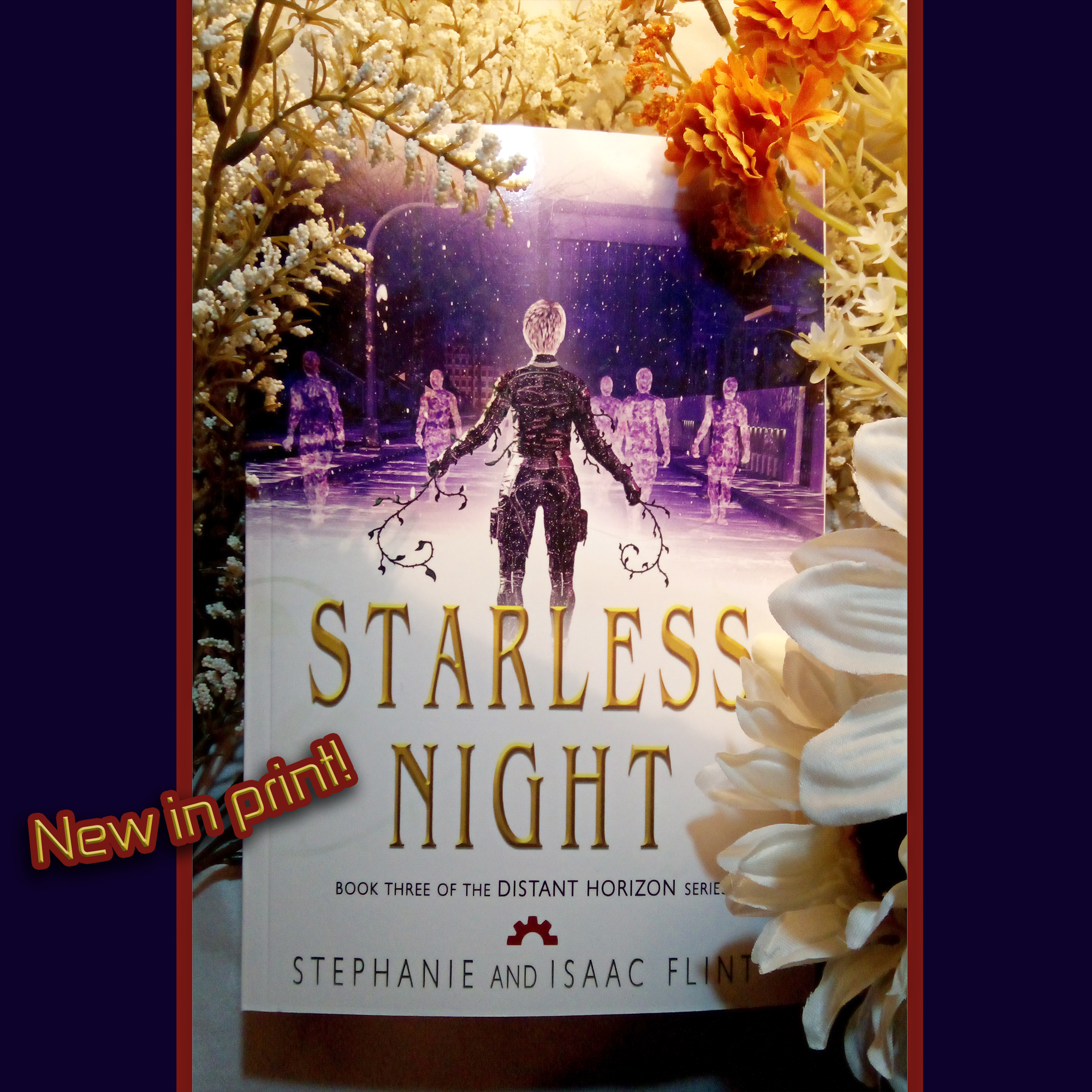
Starless Night: (Book 3 of the Distant Horizon series). Blurb needs to be updated across all retailers.
Changing Tides: (Book 4 of the Distant Horizon series). On hold while working on Legends of Cirena #9. Next step is to merge the two revised drafts and start writing the missing scenes.
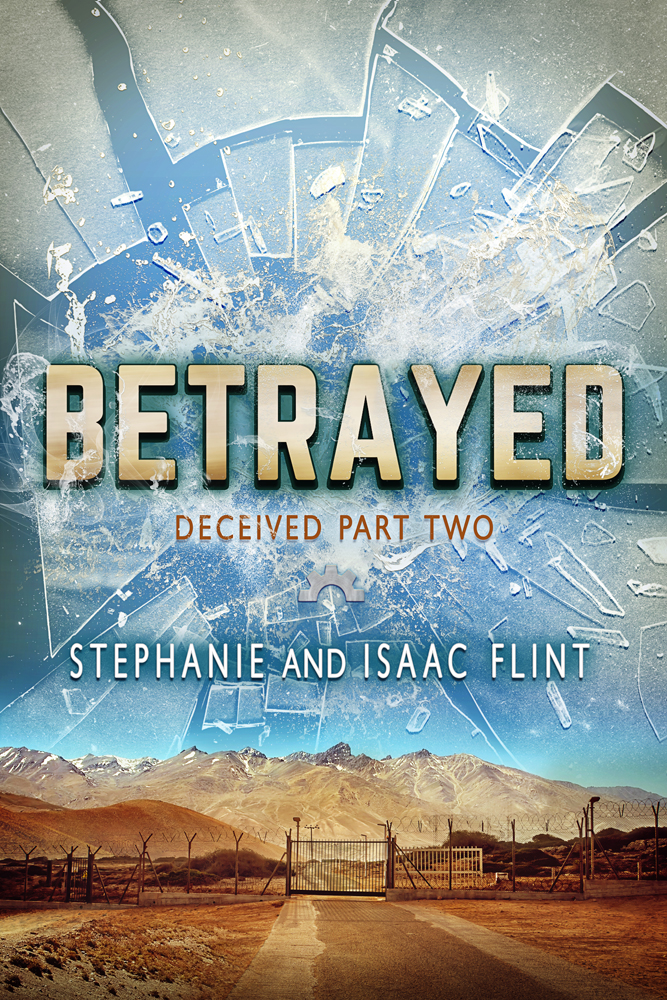
Betrayed (Deceived #2): I’ve completed the basic ebook formatting, and I’ve started one final proofread/revisions of minor notes. After this is complete, I plan to send this to beta-readers for any remaining feedback, and then set a release date for the ebook.
I’ve also determined that I probably won’t be releasing book #3 on Wattpad (it largely boils down to Betrayed not being the right genre for the platform), but I haven’t yet decided whether to continue releasing it serially on another platform or to return to ebook-only releases.
Next up: Continue revisions to Deceived #3. Add Isaac’s notes from Deceived #5 (formerly #4) into the manuscript, revise Deceived #5, and revise #6 (formerly #5) before handing it to Isaac for his feedback.
TWB 4: (Book Four of The Wishing Blade series). On hold. Next step is to finish adding the remaining outline to Scrivener, review that outline for missing plot points, and then write the rough draft.
Wishing Blade Prequel (Prequel novella for The Wishing Blade): On hold. Next step is to write the rough draft of the new scenes and begin revising the original scenes to match the updated outline.
Once complete, this is intended to be a newsletter-exclusive story.
The Legends of Cirena – Collaborative Adventure Facebook Group: On hiatus.
The Dark Forest of Aneth (“Ro’nor (“The Restless Sands of Neel”) & Zynia (“The Dragons of the Mist”) cross-over / A Legends of Cirena short novel): On hold at 52,000 words. Completing the rough draft is my plan for next month.
Goals: Add the last few scenes and polish. Edit the book cover.
The Wind Mage and the Wolf (“Livena (The Wind Mage of Maijev”) & Nuaka (“The Gryphon and the Mountain Bear”) cross-over / A Legends f Cirena short novel) : Joran’s short story is on hold. Still needs a couple scenes smoothed out, and I need to cross-reference the final scene in The Wind Mage and the Wolf (from Joran’s point of view). After that, it’ll be ready for a read-aloud and proofreading.
Huntress 3: I’ve got the beginnings of a viable outline! 😄 This one has been causing me trouble for a while, and I finally figured out that I’ve been looking at the wrong fairy tales for reference. While this still has a ways to go, I’m happy to report that I’ve started drafting a potential outline and I’ve found some reading material to help me brainstorm ideas for this book.
More importantly… I can finally envision a happy ending, which is kind of important for a romance.
Next up: Reread the first two books, browse relevant reading material, and finish creating a detailed outline.
Game Design: On hold.
Mist Catcher (Isaac’s Sci-Fi Story): On hold. The current draft sits around 111,000 words, (not including the Halloween episode?).
Marketing: I tested a method of promoting BookFunnel promos by creating new banners with covers chosen from the promo, but I continued seeing a low number of clicks. I’ve held off on doing any new promos in March.
On the bright side, I’ve maintained the newsletters, though I’ve been testing adding relevant short stories/flash fiction to them to see if that increases engagement or series interest. It’s too early to analyze the results.
I also continued the usual Amazon drip ads, though I’ve begun monitoring them to see if it’s worth their ad spend. I did create one more ad, very narrowly targetted (and still a drip ad, so it’s inexpensive), and I’m monitoring it to see how it does.
I did a test run of a paid newsletter service that has previously done well for me (about a year ago), but I didn’t see any results this time, so my hypothesis that I might see sells from that has been disproved, which means I’ll hold off on running those promos for the foreseeable future. In the future I may try other paid newsletters, but I’ll need to do more research before deciding which one, if any.
Additionally, business taxes are complete and were sent in prior to March! We also updated several of the Wishing Blade universe ebook prices, and changed our mailbox for newsletter CAN-SPAM compliance purposes, since the previous box we used went up considerably in price.
Next up: Continue adding sample chapters to the BookFunnel pages and the main Infinitas Publishing website, and update my author bio across the different websites. Eventually continue updating Stripe and Payhip so I can offer direct sales from the main website. Update the business ledger on a regular basis. Add a progress tracker somewhere for the different books. Revise Amazon ads, and overhaul book categories, keywords, and blurbs.
Other Stories: I wrote a couple pieces of flash fiction for my newsletters, one from Nsasrar’s point of view (Wishing Blade Universe), one from Pops’ point of view (Distant Horizon Universe), and I’ve started a short story spin-off of The Gryphon and the Mountain Bear. Once I have enough short stories, provided that I continue writing shorts for the newsletter, I eventually hope to collect these into one volume to release as an ebook.
I’ve edited two manuscripts for the next Writers of Warrensburg anthology, and made the first chapter revisions to my manuscript per their feedback. My next step is to finish those revisions and send them in by the end of the month.
Next up: Revise ending of YA Alien Invasion/Dystopian story.
Other on hold projects include: a “for-fun” space/portal fantasy story rough draft, Mermaid/Siren Sci-Fi short story draft, and comic script (“If I Had Asked”).
SBibb’s Photographic Illustration: I’ve mostly completed ebook formatting of my current project, though there’s a few tweaks left to make pending approval. Next up will be paperback formatting.
Future Goals: Figure out a schedule for uploading general art projects. Update the SBibbPhoto website to incorporate Daz work, and fix the SEO information.
SIFlint Art: I’ve continued my dragon hoards line-art project. Goal now is to get enough sketches to create a coloring book. I’m currently at 16 of my 20 minimum (with 24 preferred). Some of those still need to be scanned and cleaned in Photoshop. If all goes well, I’d like to have this project finished by June, but I haven’t set a hard deadline yet.
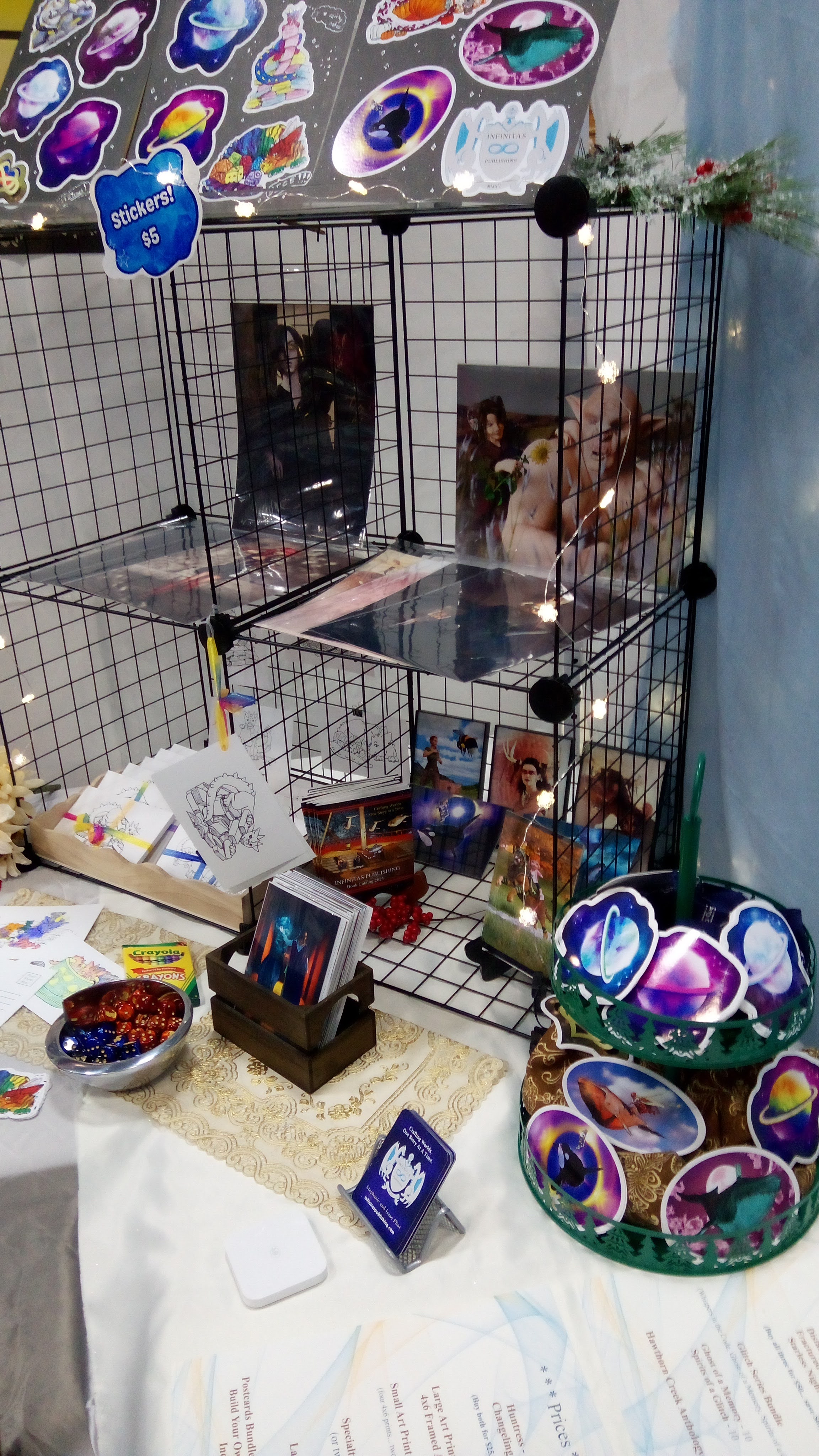
Additionally, I did a booth mock-up for a potential upcoming event. More on that closer to time.
Daz PA: I’ve almost finished with a new group pose set based on a recently released Daz character. I just need to finish the dials and thumbnails, then edit the promos, and then I’ll submit it.
I temporarily tabled my Diverse Worlds Genesis 9 morphs set since I need to learn a new technique in order to finish them per the QA team. It’s next on my list, but since I wasn’t sure how long it would take, I switched to the pose set.
* * *
Happy writing and reading (Or 3D rendering if you’re into Daz)! 🙂